 Oracle Primavera P6 Visualizer is the reporting tool that sits alongside Primavera P6 Professional and P6 EPPM. It’s used to create visual data, especially timelines and scheduling information, that is used for regular status reporting or as comparative data.
The two main types of reports it can create are Gantt charts and Timescaled Logic Diagrams (TSLDs). It also offers a schedule comparison feature. Let’s take a look at what it can do.
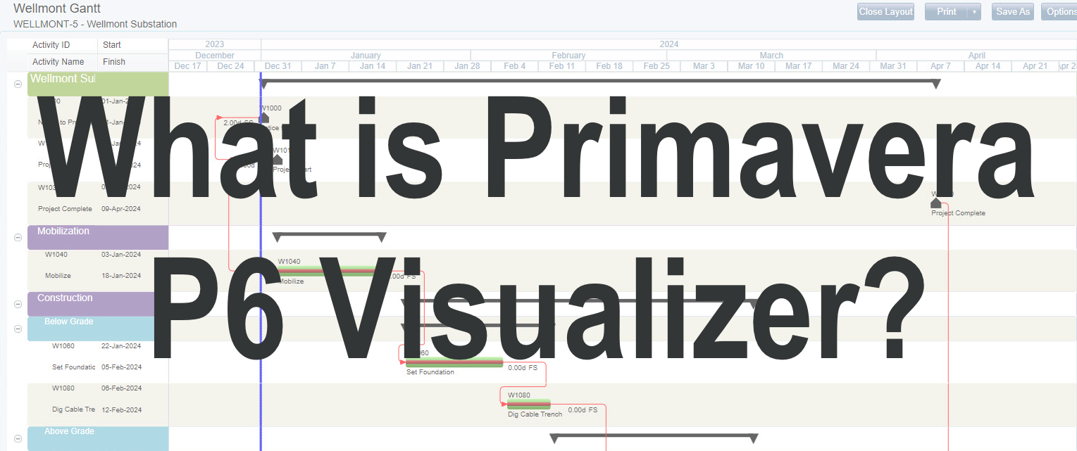
Gantt charts
The Gantt charts created by P6 Visualizer look exactly like you would expect a Gantt chart to look, with one activity per line. Each bar represents a task duration and dependencies connect bars to each other to show the relationship.
You can add a Grid view as well, and that’s a format that many project managers will be familiar with. The data in the grid shows resource information, dates and other fields. The Grid is a helpful view as it enables you to group and roll up activities so you can focus in on the information that is important.
When your graphical reports are going to senior stakeholders or the client, it’s important that they look good, and the Print Preview feature can be a help there. You can tweak the look of your report until it presents an elegant and professional view that you are happy with.
Timescaled Logic Diagrams
TSLDs are different to Gantt charts in that they show more than one activity per row, so you can fit more of the project plan into a single view. Essentially, a TSLD is a condensed version of your schedule that focuses in on the activity chains that drive delivery. They are a good way of showing the logic behind a project and how the tasks link together over time.
A TSLD can show:
- Up to 3 timescales so you can see quarters, months and weeks, for example
- Activities within the schedule and their relationships
- Bars with labels and text
- Activities grouped by a field you specify, that can be filtered or sorted
- Page breaks
- Title blocks for headings
It is a very flexible format for sharing project scheduling information.
Schedule Comparison
The schedule comparison feature in P6 Visualizer lets you see the differences between the current version of the project schedule and the original project or a baseline. You can select the fields that will be compared. You can also choose the format of the report and group activities if that makes it easier to understand and act on the information.
There are lots of ways to use the schedule comparison reports in Primavera. For example:
- Show the shifts between two project baselines
- Show the differences between two projects (useful if you are doing a lot of very similar projects like installations and want to see how two projects are performing against each other to identify areas of risk)
- Identify added or deleted tasks
- Compare project information such as budgets or the work breakdown structures
The information from the schedule comparison can be used to help keep projects on track and identify trends in project performance.
We have more information on the schedule comparison tool if you are ready to take a deeper dive.
Using Primavera P6 Visualizer
Now you know what Primavera P6 Visualizer is and what it can do, think about how you can use it in your project management. It’s simple to get started. It can be launched from within the Tools menu of Primavera P6 or opened as a separate, standalone application that can be linked to your P6 database(s).
Select the projects you want to view within the Visualizer. The workspace is where you will ‘drive’ the application and draw your visualizations. Choose your options and start drawing your layouts and diving into the reports. You can even print from Primavera P6 Visualizer.
One of the best features is the ability to automate reporting although you will need to use a program like Windows Task Scheduler to get everything set up. Once you’ve defined your reports, you can set them to run at particular times and that will save you a job.
Getting started with Primavera P6 Visualizer
Make the most of this powerful reporting tool by taking a tour and learning more about how you can get it to work for you. Using Visualizer in Primavera is covered by our P6 Professional training course which is available as a video on demand option or an instructor-led class.
Once you have learned how to create, modify and save layouts for the TSLD or Gantt chart, you’ll be able to get going straight away. The class will show you how to use the various columns, grouping and sorting tabs in the options area to modify the data you are seeing on the screen.
These days, more and more stakeholders are expecting (and prefer) to receive information in an easy-to-understand, graphical format. Primavera P6 Visualizer gives you all the tools to do exactly that, producing professional reports that can be printed or looked at on screen, showing only the relevant data in an appealing way – even for clients with low levels of experience reviewing Gantt charts. It’s a really powerful tool to take your Primavera skills to the next level!