 Deltek Acumen Fuse provides some great Gantt chart features for graphing progress of a schedule. Let’s take a closer look.
Acumen Fuse is a tool for examining the quality of schedules. Projects Acumen confirms as healthy in respect to quality metrics have a higher probability of achieving duration and cost targets. In addition to Acumen’s 300+ metrics for examining the health of the schedule there are tools to view and edit project data.
Other tools support reporting of schedule data, which are important for presentation of Fuse analyses to stakeholders. And Acumen Fuse has Gantt chart graphing features for reporting schedule progress.
This article demonstrates graphing progress using the Acumen Fuse Gantt chart graphing.
To plot schedule progress, we must first import a schedule and associated updates. The updates are imported as snapshots. Let us proceed and import a schedule baseline and two monthly snapshots. In the ‘Get External Data From’ ribbon group choose the Oracle Primavera | Single Project from a P6 XER file, Figure 1.
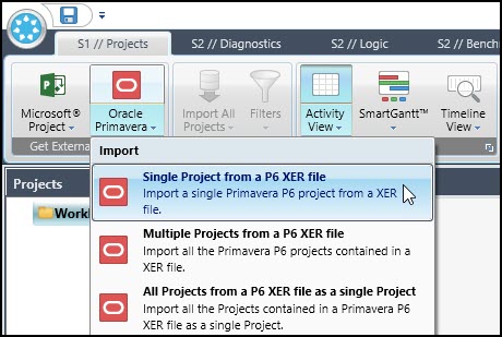 Figure 1
We locate the schedule baseline Wellmont02-BL.xer in our file system and click to open. Another dialog appears, Figure 2, asking you to choose the P6 project to import from the Wellmont02-BL.xer file.
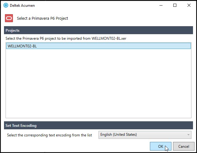 Figure 2
Well, apparently, in P6 you can save multiple projects to a single XER file. If that is the case, then here is your opportunity to choose the schedule you want to import from among multiple projects saved in the Wellmont02-BL.xer file.
We only have one schedule in the Wellmont02-BL.xer file, so we simply choose the OK button, Figure 2. The schedule Wellmont02-BL at this stage is not imported; it is linked to the workbook, Workbook1.
Let’s continue and link and then import the snapshots to the workbook. In the navigator pane we select the baseline and then right click on it, and from the popup menu we choose New Snapshot | Oracle Primavera | Multiple Projects from a P6 XER file, Figure 3.
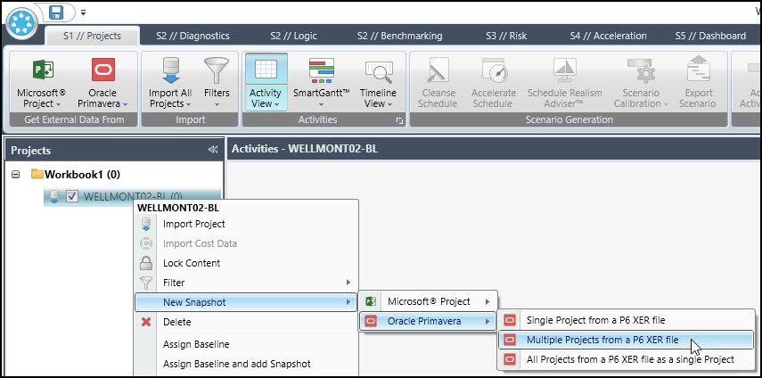 Figure 3
In the resulting dialogue we select the two monthly updates Wellmont02-M1 and M2 and choose open, Figure 4.
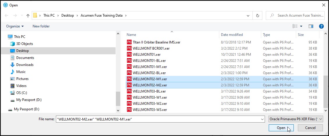 Figure 4
This links the two snapshots to the baseline, Figure 5.
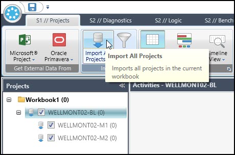 Figure 5
Note that the snapshots in the navigator pane are indented from the baseline. Now in the Import ribbon group we click Import All Projects to complete the import of the baseline and snapshots, Figure 5. The imported schedule files in the navigator pane display in Figure 6.
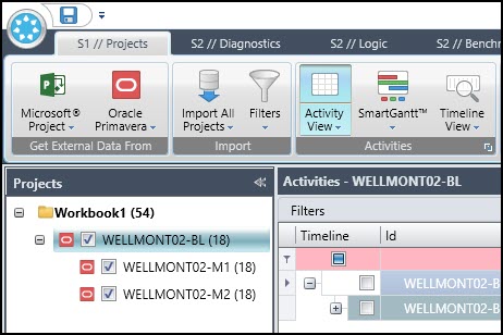 Figure 6
The next step is to assign the snapshots to the baseline. Left click on Wellmont02-M1 to select it then right click on it and choose assign baseline in the popup menu, Figure 7.
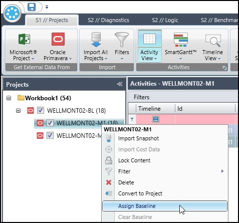 Figure 7
We continue and choose Wellmont02-BL as the baseline and click open, Figure 8.
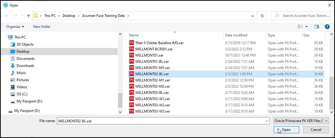 Figure 8
In the navigator pane observe the letter B next to Wellmont02-M1, Figure 9.
 Figure 9
We continue and select the second month update, M2, and from the popup menu again choose assign baseline and choose the Wellmont02-BL baseline. The baseline assignments in the navigator pane display in Figure 10.
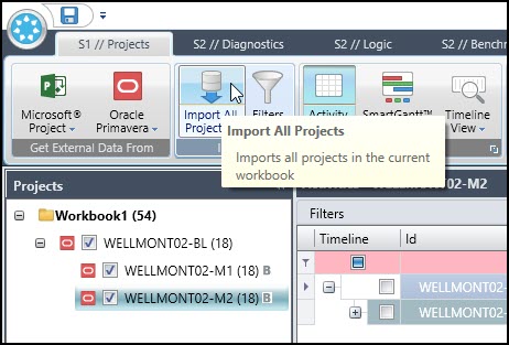 Figure 10
Although snapshots Wellmont02-M1 and M2 have the letter B indicating they are assigned a baseline, we must continue and import all projects again to confirm the assignments, Figure 10.
Note, it is important to Import All Projects again after making the baseline assignment for the snapshots. Otherwise, your comparison plots will be incorrect.
Now we are ready to view our schedule data and make graphs. Select the Wellmont02-M1 snapshot and in the Activities ribbon group, choose Activity View | Grouping | Display Level – 4, Figure 11.
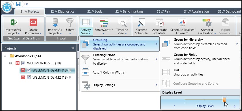 Figure 11
This expands the data to show the entire activity table and Gantt chart, Figure 12.
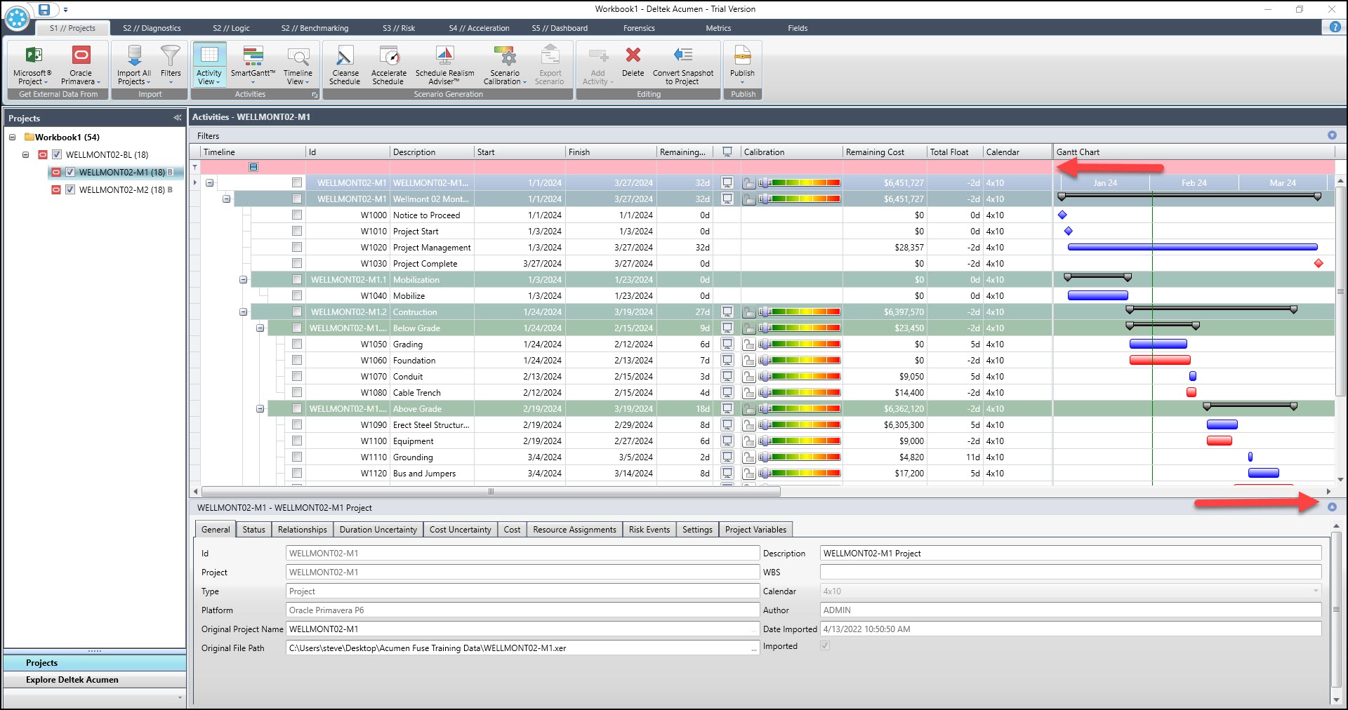 Figure 12
To view more of the activity table and Gantt chart click the button to collapse the bottom details dock and move the Gantt chart frame separator left, Figure 12. The resulting activity table and Gantt chart display in Figure 13.
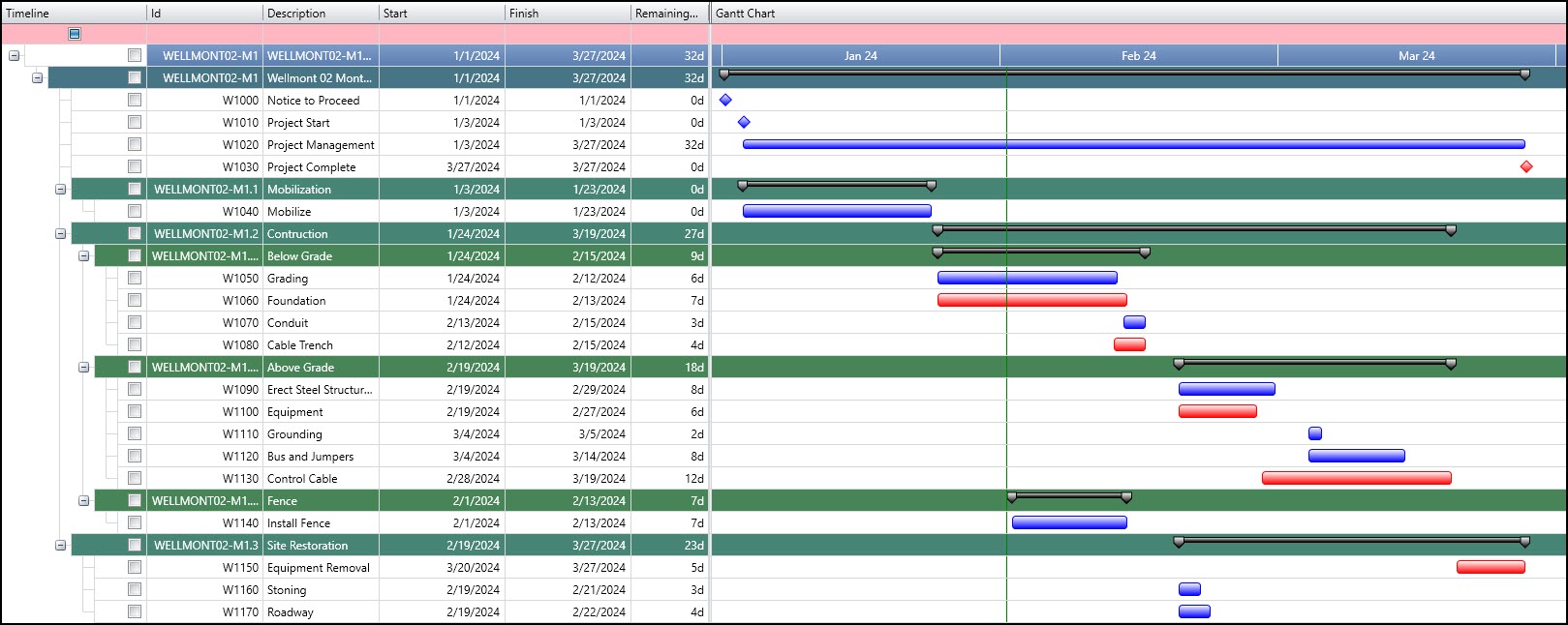 Figure 13
Now we want to show both the baseline and month one progress on the Gantt chart. This is done with the SmartGantt feature. We proceed and click Smart Gantt | Top Bar | Dates | Baseline, Figure 14.
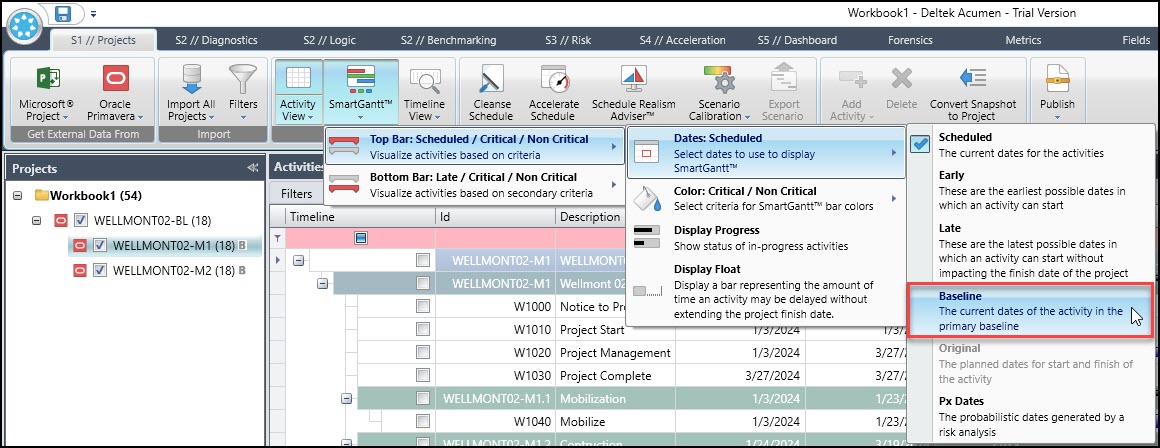 Figure 14
This sets the baseline as the top bar on the Gantt chart. We continue and choose Smart Gantt | Bottom | Dates | Scheduled, Figure 15.
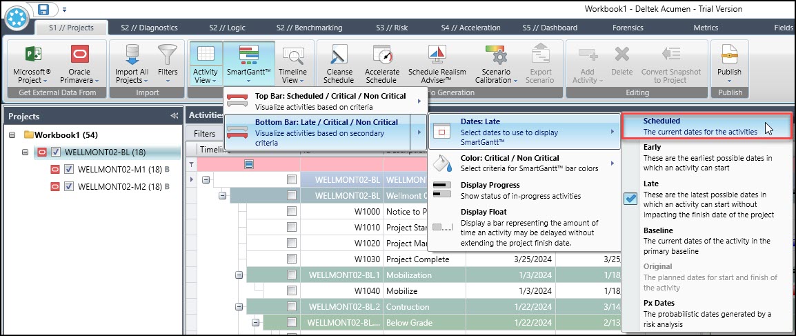 Figure 15
This sets the current schedule as the bottom bar on the Gantt chart. The resulting baseline and M1 snapshot appear in Figure 16.
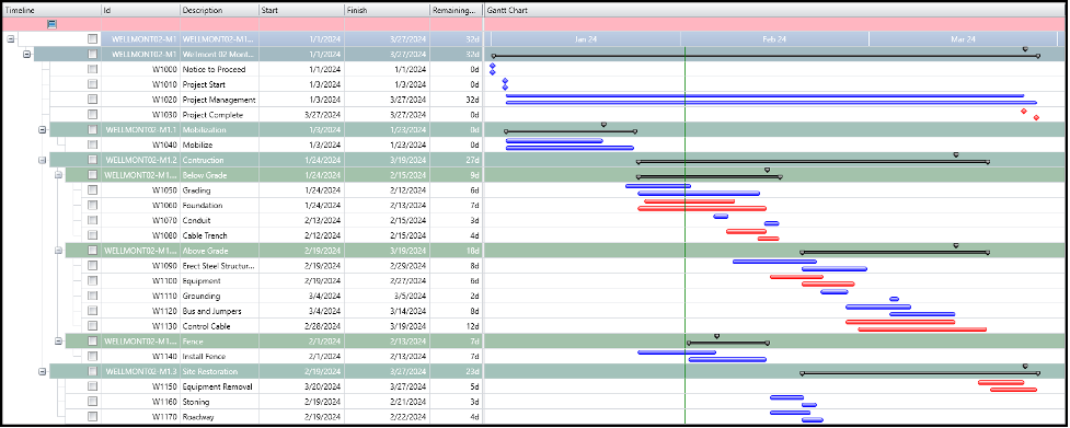 Figure 16
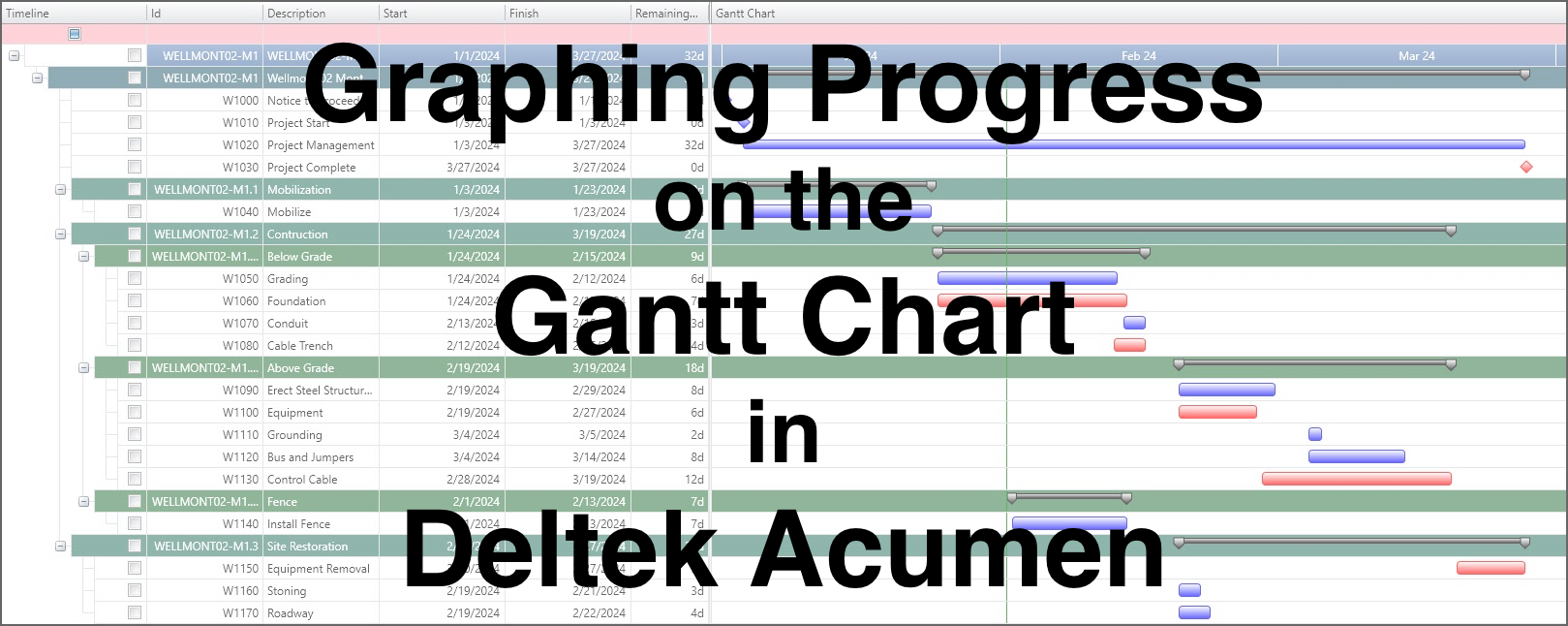
Thus, we have the month one schedule progress compared to the original plan on our Acumen Fuse Gantt chart.
Summary
The Gantt chart is the heart of scheduling software. An understanding of the Gantt chart is important. Therefore, it is good for the scheduler to study the Gantt chart graphics features.
In Acumen Fuse the scheduler can plot a Gantt chart with top and bottom bars, and each defined, as appropriate for graphing progress of the schedule. Before displaying progress on the Gantt chart the scheduler must import a baseline with snapshots and assign the baseline to the snapshots.
Then presenting progress on the Gantt chart is a simple matter of defining these top and bottom bars using the SmartGantt feature. In this way the scheduler presents progress compared to the original plan on a single Gantt chart in Acumen Fuse.