 Navigate the Main Layout and Tools in Primavera P6
Primavera P6, to a novice scheduler, may appear a rather daunting experience. With numerous navigation tools and options, even a seasoned scheduler may not be sure of all the functions offered in the different toolbars.
Here’s how to navigate the main layout and tools in Primavera P6. The following article explores and defines in detail the different navigation tools available. We have also produced a short video that shows viewers how these affect the Primavera P6 interface when different tools are selected.
You can also read through the steps shown in the video below
Below in Figure 1 is a standard view that schedulers will be familiar with and use on a day-to-day basis.
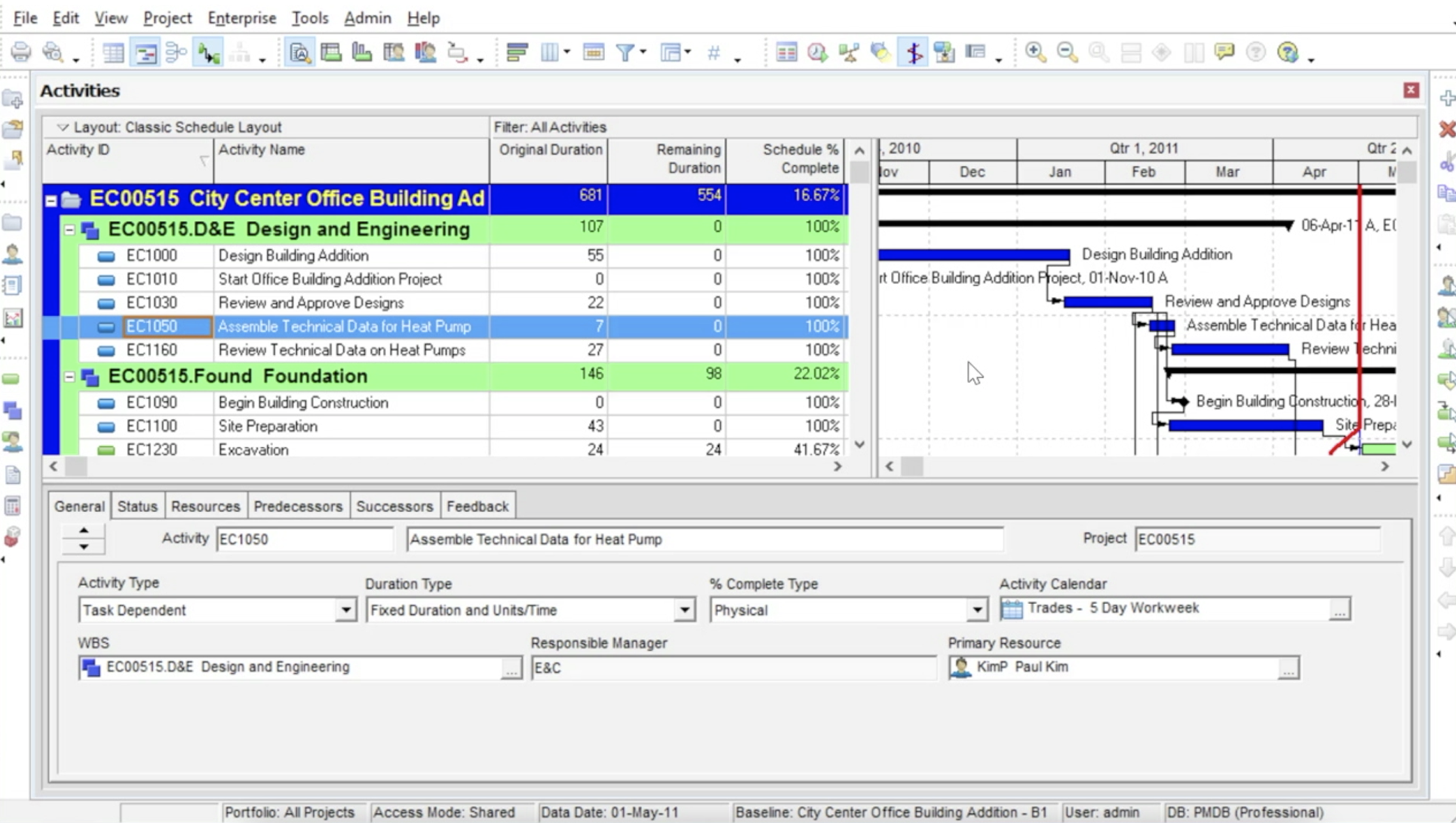 Figure 1
The Primavera P6 interface is made up of six elements that help you navigate the main layout:
- The menu bar right at the top of the screen provides access to all the main features and functions of Primavera P6.
- The main horizontal toolbar found immediately below the menu bar, provides quick access to the features that are common to most of the views used.
- To the extreme left and right of the screen are two vertical toolbars that provide additional access to features and functions that are mostly concerned with accessing and modifying functioning areas of Primavera P6. The left-hand vertical toolbar is primarily focused on the navigation of the main views.
- At the base of the screen is the horizontal information bar that displays general data for a selected project.
- The top layout is divided into three areas; to the left is the table area, the top right section is a graphical area called a Gantt chart. These two sections are separated by a moveable, vertical divider.
- The Bottom layout is the lower part of the screen and is separated from the top layout by a moveable horizontal divider. The content of the bottom layout is a set of tabs that display detailed information about an item selected in the top half of the screen.
All of the main views in Primavera P6 can be modified, switched off, or resized depending on the user’s preference.
Tool Groups
The vertical toolbar on the left-hand side of the screen is made up of three main segments; (separated by dashes) known as tool groups. Moving from the top to the bottom of the screen the first tool group is called Standard. The Standard tool group contains three buttons, ‘New’ for opening a new project, ‘Open’ used for opening an existing project, and ‘Close’ used to close a project as shown in Figure 2.
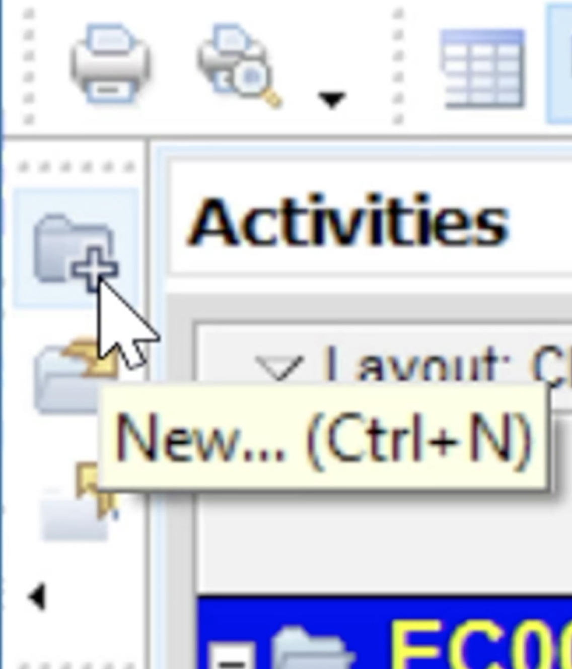 Figure 2
The following two tool groups are Enterprise and Project. Both of these tool groups are used to navigate among the major views available in Primavera P6. The first group of four icons forms the Enterprise group.
From top to bottom the icons are Projects, used to open the projects’ view, Resources, used to open the resources’ view, Reports, used to open the reports’ view and ‘Tracking’ used to open the tracking view for in-progress projects, as shown in Figure 3.
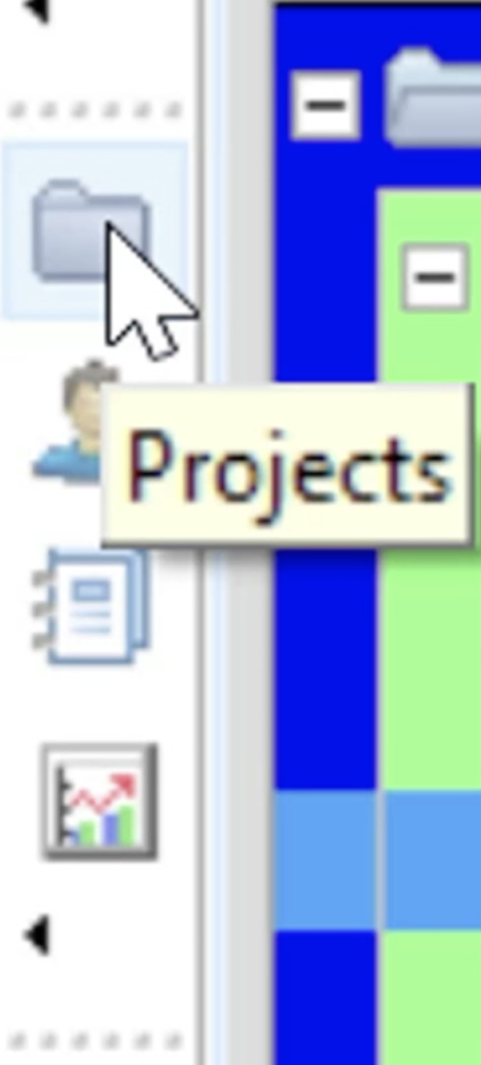 Figure 3
The final group of icons on the vertical toolbar are the Projects Icons, as shown in Figure 4. From top to bottom these are:
- Activities that open the Activities view
- Work Breakdown Structure (WBS) opens the WBS view so that schedulers can get a closer look at the scheduled work
- Resource Assignment view where all resources appertaining to the project are listed
- WPS & Docs or Work Products and Documents is a view that allows the scheduler to manage documentation associated with the project
- The Calculator button represents the project expenses where planned, actual and remaining costs can be assigned to the project for such items as material, equipment, and travel, etc.
- The Risks button provides a view for entering and tracking potential risks that might occur during the project life cycle
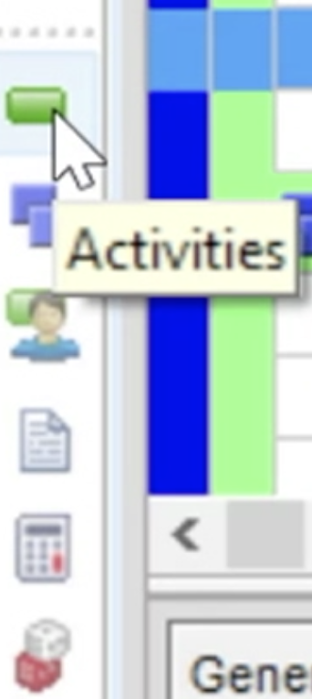 Figure 4
Top and Bottom Layout Tool Groups
These navigation tools are used to change the data displayed in the Table, Details, and Gantt chart areas. The first group of tools found in the ribbon area at the top of the screen is for the top layout, as shown in Figure 5.
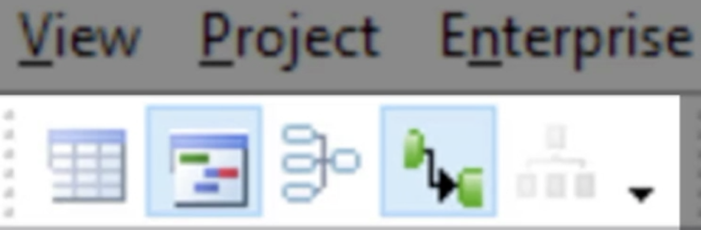 Figure 5
Moving along the toolbar from left to right, the first icon when selected allows a full view of the Table area only. The next icon is used to turn on the Gantt chart view. Following the Gantt chart icon is an Activities icon that will display the project activities as nodes in a precedence network, rather than as bars, as shown in Figure 6.
 Figure 6
The next icon is used to toggle the relationship lines on or off in the Gantt chart. Finally, the last icon in the Top layout tool group is only active in the WBS view. When selected this allows the WBS to be displayed as a chart as shown in Figure 7.
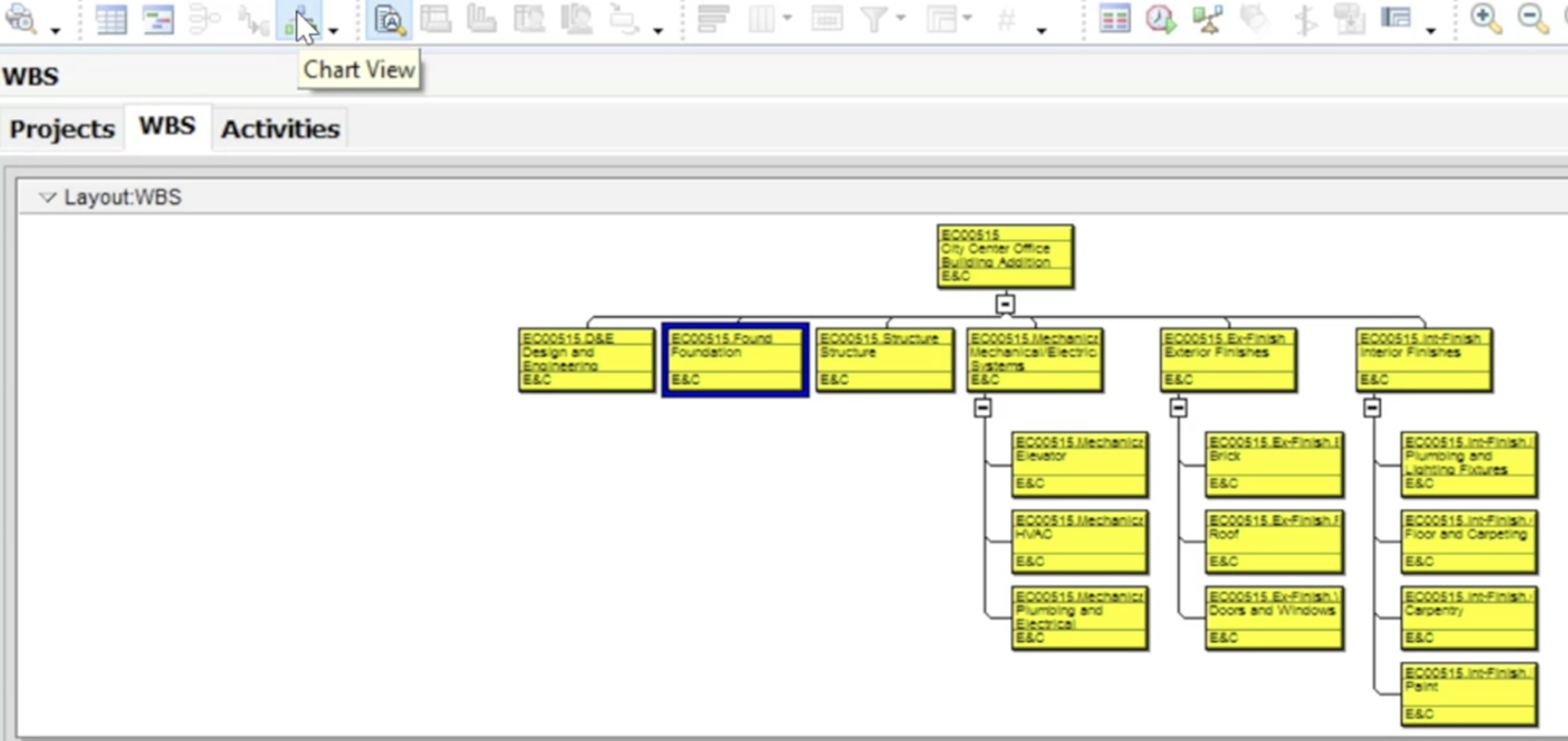 Figure 7
The bottom layout tool group allows modifications in the bottom half of the screen and these are adjacent to the top layout tool group as shown in Figure 8.
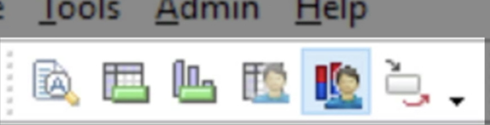 Figure 8
Again, moving along the toolbar from left to right the first icon is the details button. This will switch on the details area at the bottom of the screen if it has been toggled off.
The next icon is the Activity Usage Spreadsheet. When activated it displays the project activities with a time-phased spreadsheet of the labor or costs as shown in Figure 9.
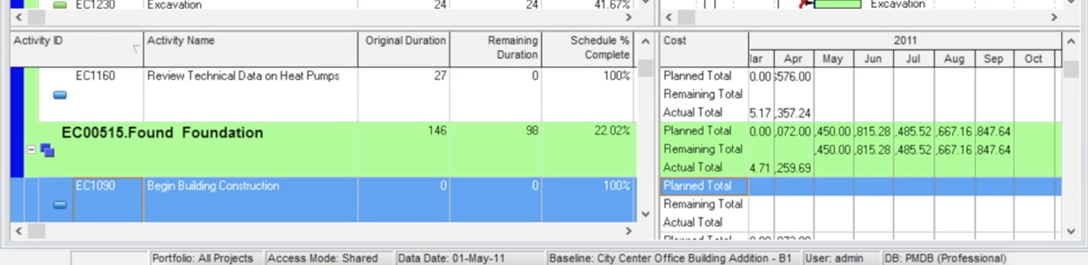 Figure 9
The next icon is the Activity Usage Profile that displays a profile of all selected activities as a histogram as shown in Figure 10.
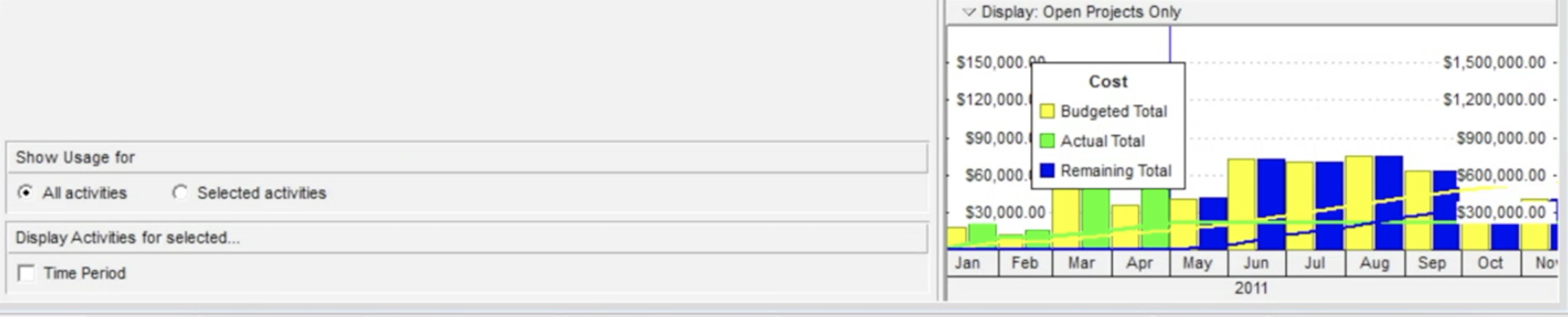 Figure 10
Following the Activity Usage Profile is the Resource Usage Spreadsheet. This displays a list of resources being used on the project with a time-phased spreadsheet of the hours or costs for the selected resource as shown in Figure 11.
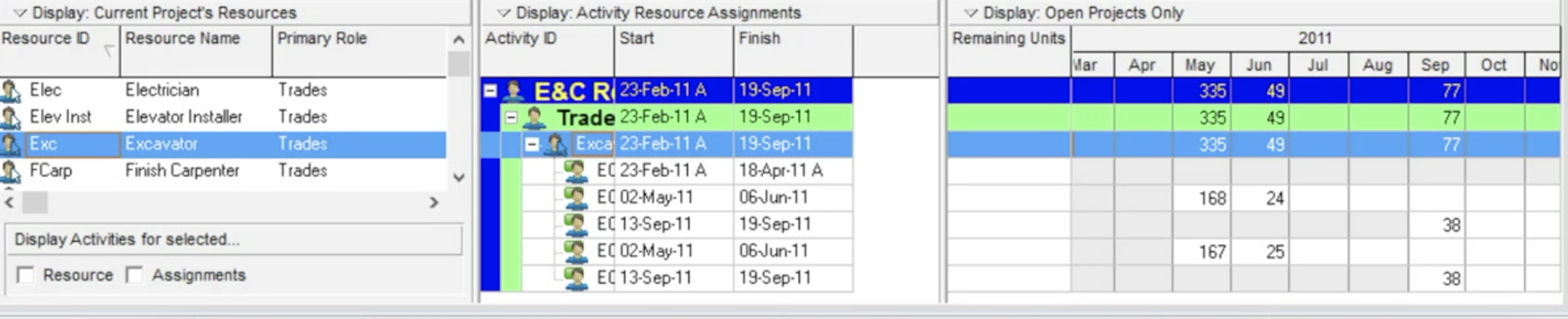 Figure 11
The next icon is the Resource Usage Profile, which displays the resource loading as a time-phased histogram.
The final icon in the bottom layout tool group is Trace Logic. This displays a logic network diagram that is useful for walking through the activity network to examine relationships in detail.
The Display Group
The final group of navigation tools the Display Group, shown in Figure 12, allow users to zoom in and out of the Gantt chart view or rearrange the order of the main view tabs.
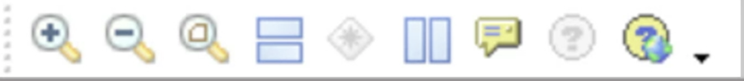 Figure 12
Again, moving from left to right the first three icons, Zoom In, Zoom Out views, and Zoom to Best Fit adjust the time scale of the Gantt Chart. The following three icons are the New Horizontal Tab Group, Merge All Tab Groups, and New Vertical Tab Group.
These are active when there is more than one tab open. When they are selected, they reorganize the panes to accommodate the views in a horizontal or vertical configuration. By clicking the Merge All Tab Groups button any changes are reverted to the default configuration.
Summary
The layout of Primavera P6 can easily be configured to a schedulers’ preference. The various tools available allow the scheduler to navigate the main layout to review and assign costs, monitor resources and track potential risks. Activity and Resource usage can also be viewed as time-phased histograms. Hopefully this overview of how to navigate the main layout and tools in Primavera P6 is helpful to you.