 Both Gantt charts and Timescaled Logic Diagrams (TSLD) display schedule network logic, but TSLD charts provide a more distinct grouping of activities by deliverable. Let’s explore this further.
Primavera P6 Visualizer is a schedule graphing and comparison tool that comes as a separate module in P6. The Visualizer comparison feature is helpful for pinpointing the differences between versions of a schedule. Visualizer also has two graphing features:
- Gantt charts along with an activity table
- Timescaled Logic Diagrams
The Gantt chart displays activities (tasks or efforts) displayed against time. Gantt charts show the start and finish dates of deliverables and associated activities on a vertical axis and time intervals on the horizontal axis. Each respective deliverable or activity appears on its own line.
Modern day Gantt charts also show the dependency relationships between activities. In a similar way TSLD charts display deliverables and tasks vertically and time intervals horizontally.
What makes the TSLD chart unique is that in addition to the start and finish dates of deliverables there is a deliverable banner that stretches the duration of the schedule. This provides for a more definitive separation between deliverables which helps to compartmentalize activities into these respective deliverables.
Tasks in the TSLD appear on their individual line, except activities in series are displayed on one row. So, deliverables on the TSLD chart are banners that group together the respective efforts required to produce them.
This article demonstrates how to plot Timescaled Logic Diagrams in Primavera P6 Visualizer.
Below in Figure 1, we have our demonstration Primavera P6 project schedule called Pipe Branch.
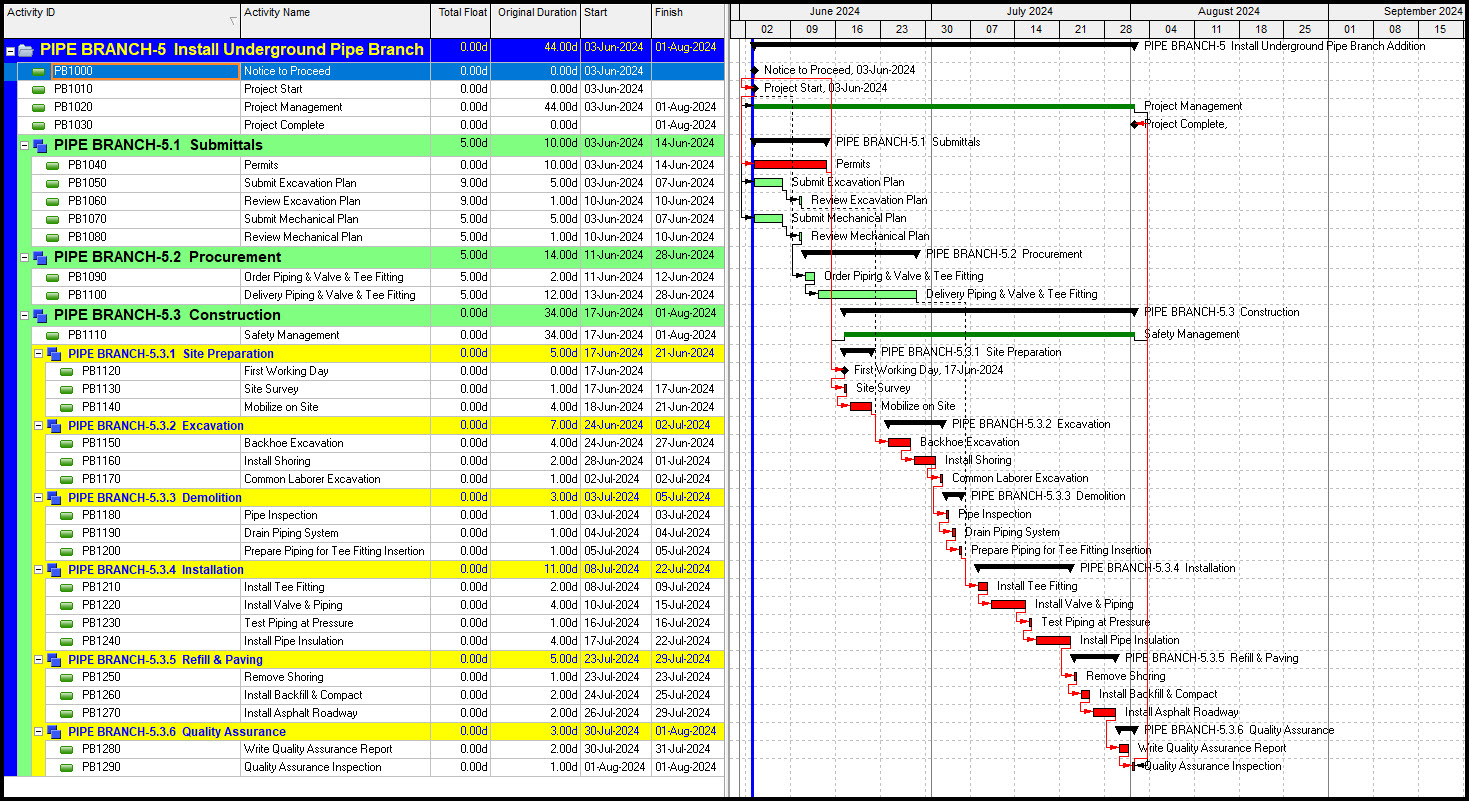 Figure 1
To activate the Visualizer module, choose, Tools | Visualizer, Figure 2.
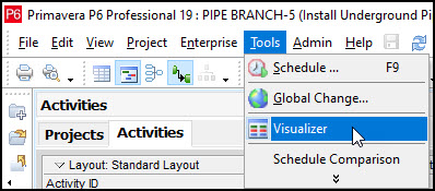 Figure 2
In Visualizer select the + button and choose TSLD from the drop-down menu, Figure 3.
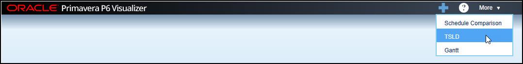 Figure 3
In the resulting dialog drill down to locate the project, Pipe Branch-5, add it to the selected projects, and click next, Figure 4.
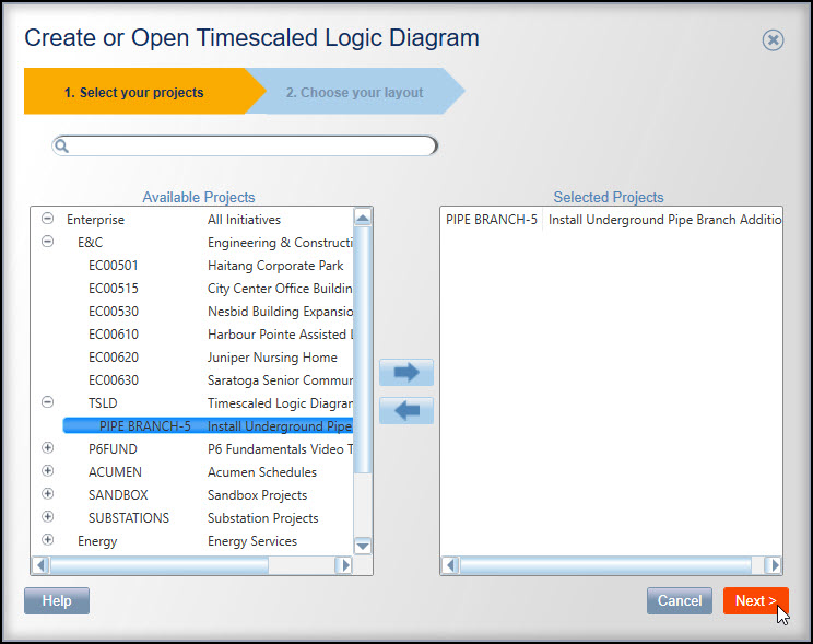 Figure 4
We want to create a new Timescaled Logic Diagram. Toggle Create New, enter the name, Pipe Branch, and click draw. The resulting TSLD plot displays in Figure 5.
 Figure 5
Okay, the TSLD plot needs some work. To make necessary adjustments to the plot click options, Figure 5. This brings up the TSLD options that has several tabs, Figure 6.
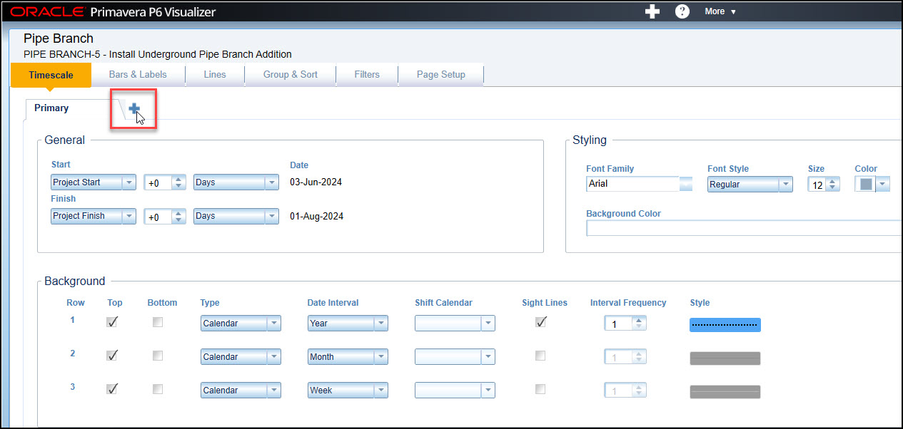 Figure 6
We want to zoom in our chart. To do this click on the + sign next to Primary, Figure 6. In the Zoom Area 1 set the Start to Project Start and the Finish to Project Finish, Figure 7.
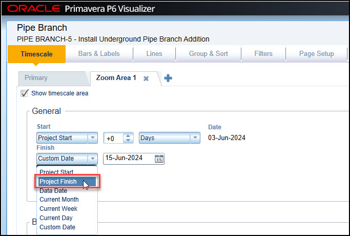 Figure 7
The Project Start and Project Finish displays red outlines indicating the dates are not set properly, Figure 8.
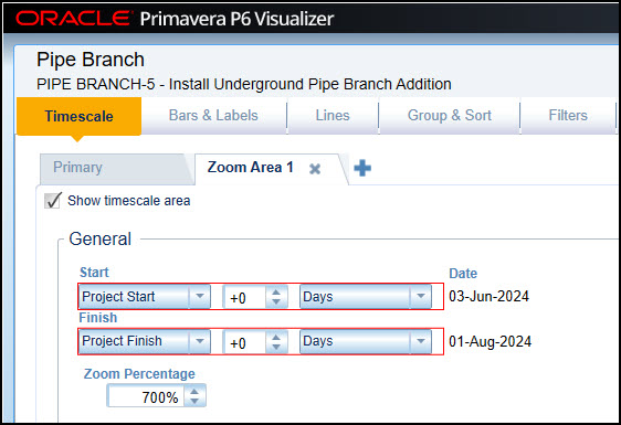 Figure 8
To correct this issue set the Project Finish to minus one day, Figure 9.
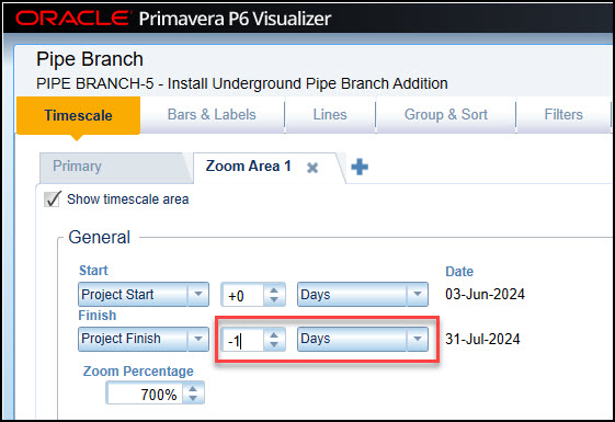 Figure 9
Set the Zoom Percentage to 300%, Figure 10.
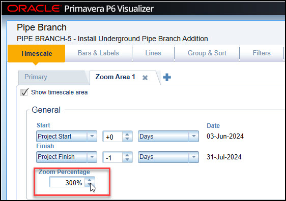 Figure 10
You may have to experiment to get the most suitable zoom setting. Next choose the Lines tab, Figure 11.
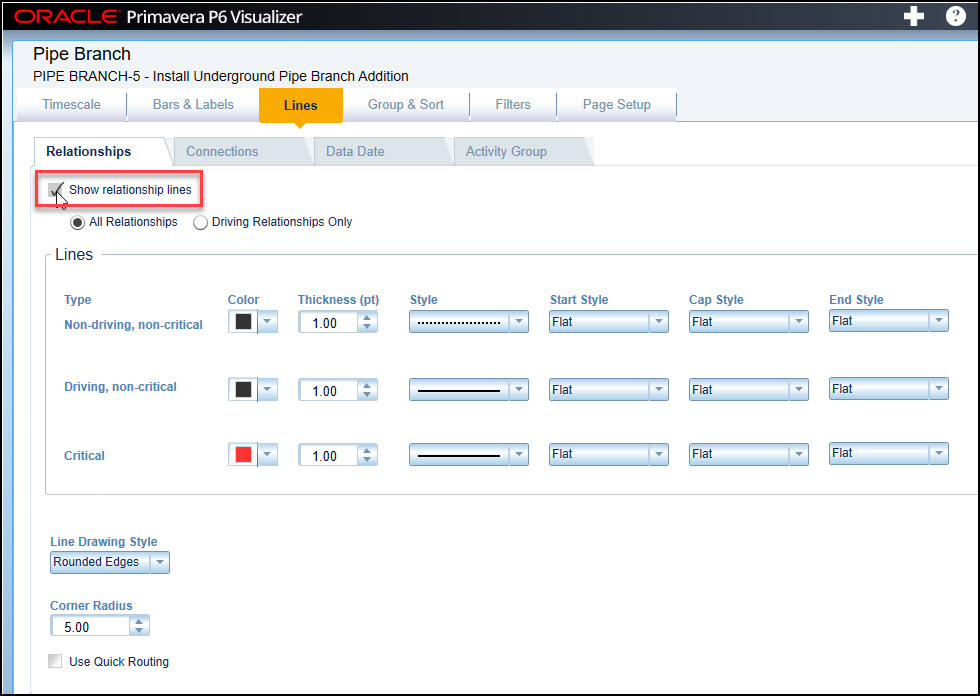 Figure 11
Toggle on Show relationship lines, Figure 11. Continue and choose Group & Sort tab, Figure 12.
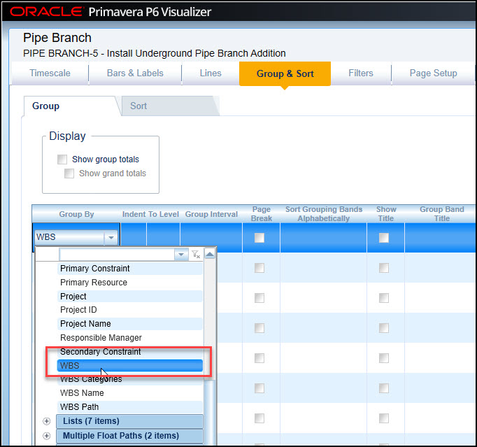 Figure 12
The select Group By | General | WBS, Figure 12. Choose Page Setup and select the Legal paper size, Figure 13.
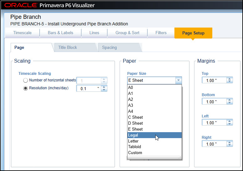 Figure 13
Finally, choose Save & Draw. The P6 Pipe Branch TSLD graph appears in Figure 14.
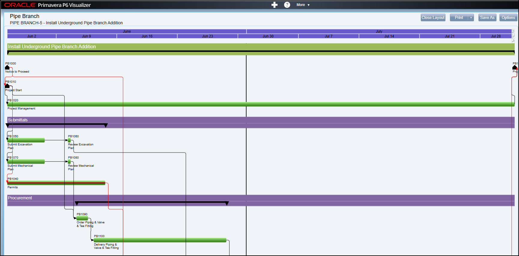 Figure 14
Okay, we want to adjust the start and finish of the diagram, so we clearly see all the labeling. Choose Options | Timescale and set project start to minus 4 days and Project Finish to plus 1 week, Figure 15, and click Save & Draw.
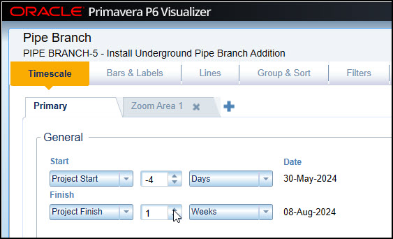 Figure 15
The final Pipe Branch TSLD graph appears in Figure 16.
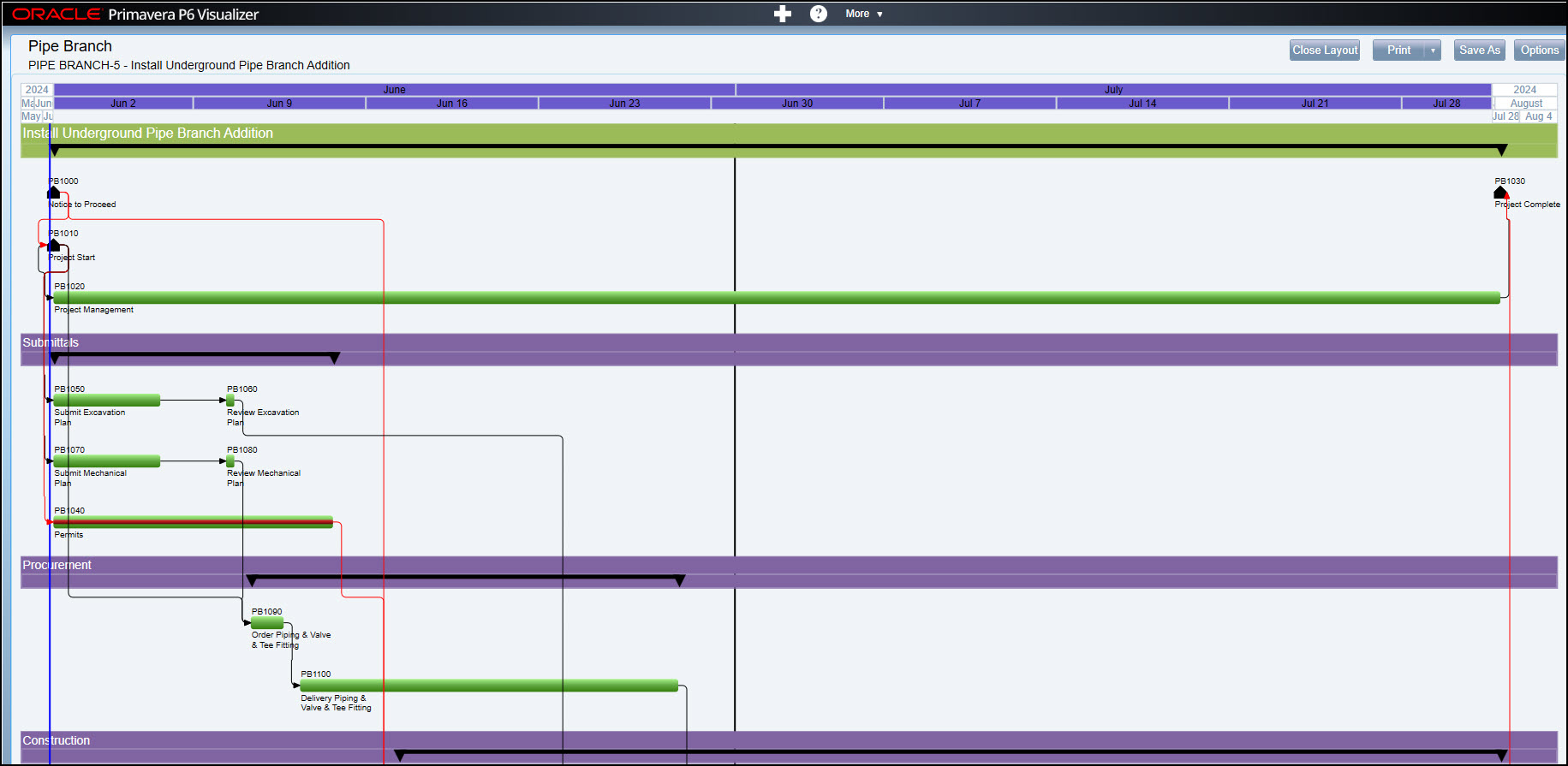 Figure 16
Observe that Submit Excavation and Review Excavation Plan are in series and appear on the same row. The same goes for Submit Mechanical Plan and Review Mechanical Plan; they are in series and appear on the same row.
Summary
Primavera P6 Visualizer provides two means of graphing your schedule:
- The traditional Gantt chart
- The TSLD diagram
The advantage of Timescaled Logic Diagrams is that it has deliverable banners for the life of the project. The other unique feature, is that activities in series are placed on the same row. Just like the Gantt chart, it has relational lines to show dependency and red lines and red bars to indicate the critical path.
It does not replace the Gantt chart, but complements it. Again, its deliverable banners make for clear groupings of project work efforts.