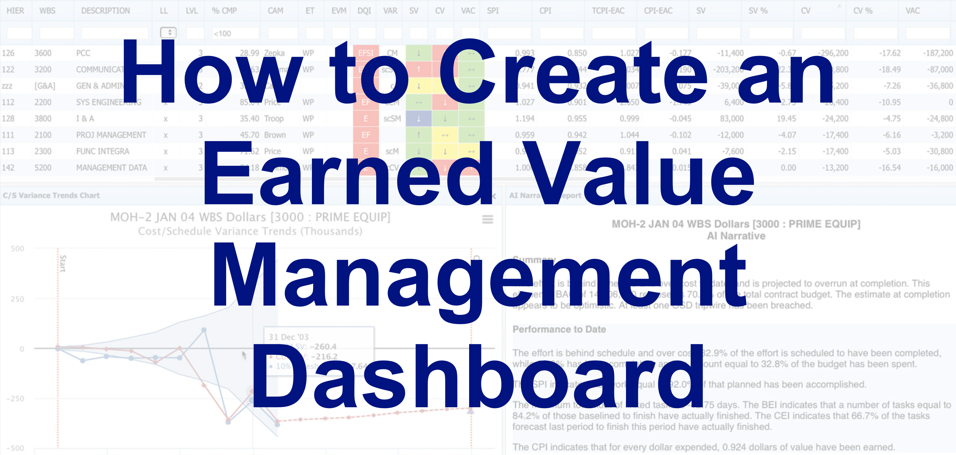
 Earned Value Management Dashboard
Earned value management is a robust way of applying project controls to budget and schedule. It’s performance-led, so it’s a reliable approach for understanding real-time progress and spotting trends. Monitoring can be done regularly, and when you’ve got the right reports set up, the insights you need to monitor status are largely generated automatically. Dynamic dashboards are a time-saver as well as avoiding any human error or data entry risk.
Many project management ‘standard’ progress reports in methodologies that do not use earned value management, present a backwards-looking assessment of a single point in time. They don’t integrate schedule, risk and cost to help project managers respond to the real challenges of control. There’s no ability to forecast forwards based on current performance because the data only takes historical (actual vs planned but not forecasted) progress into account.
Earned value metrics fill that gap. Creating a dashboard for your project or program will give you all the information required at your fingertips.
How do you track earned value?
Common calculations that support earned value management include:
- Schedule Performance Index
- Budgeted Cost of Work Performed (earned value)
- Cost Performance Index
The good thing about dashboards is that you can include any relevant measures or even narrative sections, so you don’t have to limit yourself.
Metrics to include on an earned value dashboard template
Selecting the right metrics to use is important. There is no single set of metrics you have to use, so select the data points and measurements that will enable the team to best manage the program. These could include:
- Schedule performance
- Cost performance
- Staffing and resourcing measures
- Risk and opportunity measures
- Technical performance and quality measures
- Procurement and contract health assessment measures
- Customer satisfaction.
Choose the areas you want to focus on and then dive into what data you have to support them. For example, schedule performance can be represented on a dashboard with the following individual metrics:
- SPI
- Schedule variance
- Percent complete (activity level and aggregated)
- Baseline execution index
- Percentage of tasks completed on or before the baseline finish
- Total float consumption
And others.
Cost performance has an equally wide range of data points to choose from, or you may find them all valuable. For example:
- CPI
- Cost variance (and as a percentage)
- Variance at completion
- Estimate at completion
- To Complete Performance Index
- Percent of budget spent
- Management reserves position
How to select your unique dashboard metrics
Too many metrics, and the project manager won’t know where to look. Too few, and there won’t be enough information to adequately track performance and course correct as required. The right dashboard shows the right level of data and only the metrics required for active project control management.
Make a list of all the possible metrics you could include from the available data sources and what the project team requires, and then consider each of them in turn. Check you are collecting the data for them so could present them – if you are not and the item is considered essential, then the starting point is finding a way to collect the information required.
Where there are a couple of metrics that relate to the same element, it may be worth selecting just one or two. Others could be included in an appendix or further down the screen but not in the main part of the dashboard.
Where to get the dashboard data from
Ideally, the data in your dashboard should be pulled from the other systems. Manually entering data in a dashboard template (for example, a slide created in PowerPoint) is time-consuming and subject to human error.
There might legitimately be times where you need to present project performance on a slide deck, but as a regular routine for the management of the project, the more we can automate reporting, the easier it will be for the project team. In our experience, if the data is hard to access, people stop looking for it. That’s definitely a situation to avoid.
Testing the dashboard
It can be hard to know if your dashboard is fit for purpose until you’ve put it to the test. Set up the dashboard in your earned value management software or another enterprise data analysis and reporting tool. Run it for a couple of months and collate feedback about how easy it is to use.
Then make any changes by adding, excluding, rolling up or digging into the detail so the team has what they need to actively manage the work.
Earned value dashboards in Excel
You can get earned value management dashboard templates in Excel format, but we don’t recommend leaving your critical project controls to a spreadsheet. There are better tools out there that integrate with Oracle Primavera P6 and the rest of your enterprise estate – and that don’t require such a large admin overhead to keep populated with the correct WBS each time you want to run the reports.
We recommend enterprise-ready tools like Deltek Cobra and Acumen. These are relatively straightforward to set up and manage all your earned value reporting and risk management within an integrated environment. Join us for some Deltek training to see how the tools work in practice and how much easier they are than relying on spreadsheets for this crucial aspect of project controls management.