There are numerous gridline options which are used on the Gantt chart in Microsoft Project. Gridlines on the Gantt chart can help line up the task bar with the date so that the chart is easier to read. By inserting gridlines onto the Gantt chart, it helps to improve the appearance. If you have to print your schedule off for a stakeholder meeting, the stakeholder would find it aesthetically appealing and the information about your project progress easier to digest.
So how do you insert and change gridlines in Microsoft Project? Let’s take a closer look.
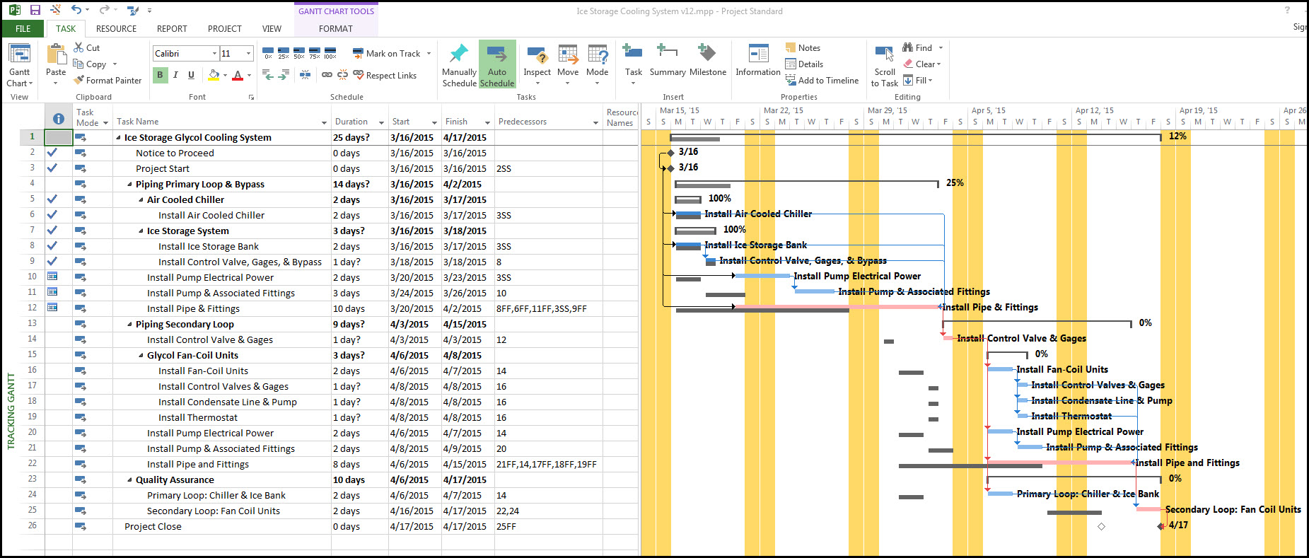
Below in Figure 1, we have a project schedule for an ‘Air Cooled Chiller & Ice Storage System Installation’. The Project was updated through Thursday, March 19th, 2015, but without gridlines, we find the schedule hard to read.
 Figure 1
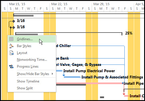
To insert some gridlines, we right-click anywhere on our Gantt chart to bring up ‘Gridlines’ as displayed in Figure 2.
Figure 2
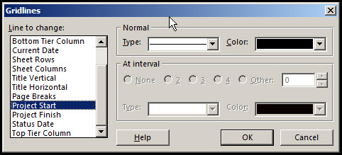
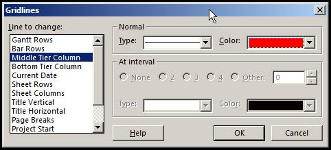
In the ‘Gridlines’ dialog box, we scroll down to ‘Project Start’, select a black line and ‘OK’ it, as in Figure 3.
Figure 3
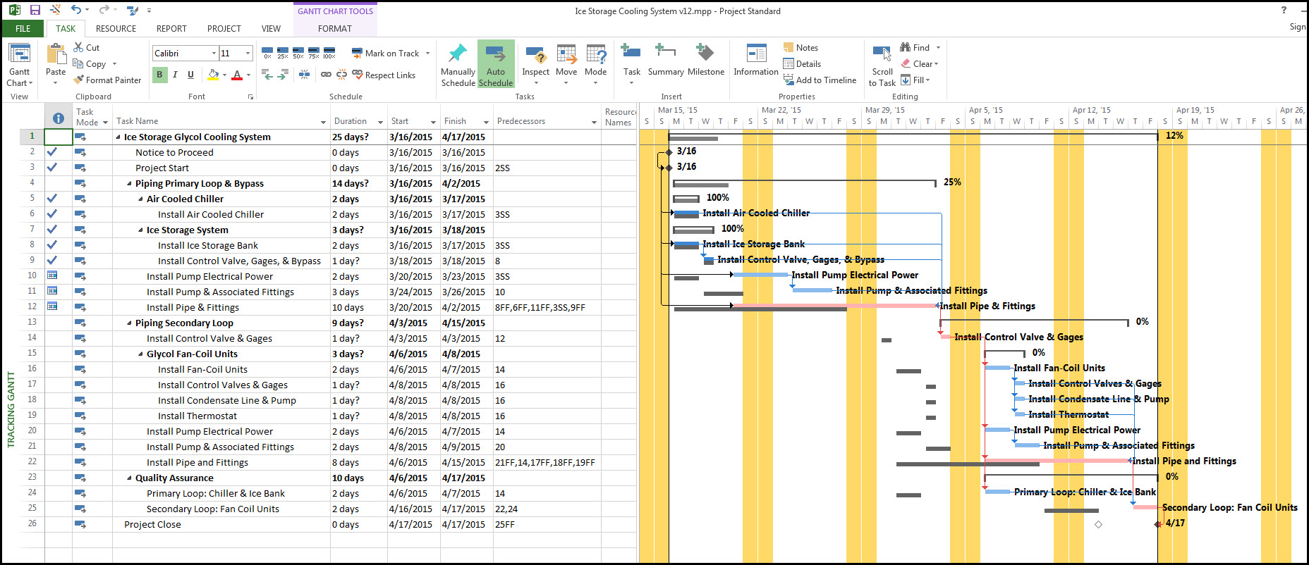
Next, we select ‘Project Finish’, by scrolling down the list in ‘Gridlines’ and again, we select a black line and OK it. Our Gantt chart now has a start date for our project and a forecasted finish date marked, as displayed in Figure 4.
Figure 4
We want to insert a Status Date line into the Gantt Chart, so we return to the ‘Gridlines’ dialog box, scroll down to select ‘Status Date’. This time we change the color to blue so that the line is clearly defined on our Gantt chart, as displayed in Figure 5.
Figure 5

Our Status date, displayed by the blue line is set to Thursday, March 19th (the last day the project was updated). We want to display the Gantt Rows with dotted lines so that the individual task bars are easier to read from the associated activity table. We return to the ‘Gridlines’ dialog box, select ‘Gantt Rows’ and change the line to dotted for every row.
Now we want to mark each weekly period with a red line and each day with a dotted orange line. The trick is knowing that the Middle Tier Column, Figure 6, refers to the weeks.
Figure 6
To confirm that the ‘Middle Tier Column’, refers to weeks we cheek in ‘Timescale’ by right-clicking on the timescale in the Gantt chart to bring up the ‘Timescale’ dialog box as below in Figure 7.
Figure 7
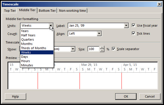
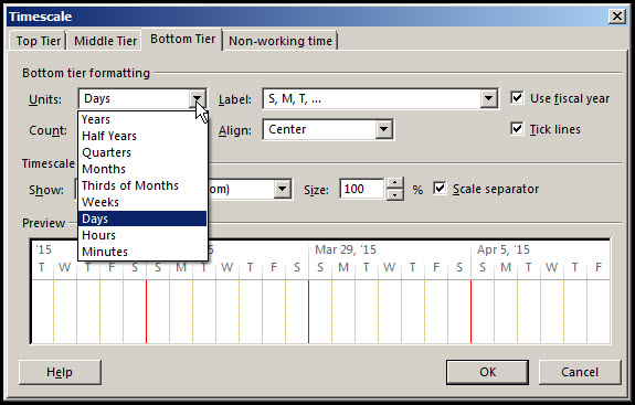
As you can see from the dropdown menu, under the ‘Middle Tier’ tab in ‘Timescale’ there are multiple periods to pick from to set the ‘Units’. We choose weeks, as it will work well with our schedule. By making the ‘Middle Tier’ selection, the ‘Bottom Tier ‘tab refers to days, as in Figure 8.
Figure 8
Our final Gantt chart is displayed below, in Figure 9 with our start and finish lines, a status date line, Gantt Row lines, Weekly lines, and daily dotted lines.
Figure 9

Summary
There are numerous options available when inserting or changing gridlines in a Gantt Chart. Lines can be displayed full, dashed or dotted and there are multiple color options so that you can easily distinguish one feature from another in your Gantt chart.
The trick to making weekly and daily periods is selecting the correct Units in the ‘Middle Tier’ tab, set the units to weekly and in the ‘Bottom Tier’ tab set the units to daily. However, with the multiple different periods available you may want to explore a different criterion for your Gantt chart.