The following video is a live demonstration of a risk analysis process being performed in Deltek Acumen. Once the analysis has been completed, you will see an explanation of the resulting in the Deltek Acumen Risk Exposure chart.
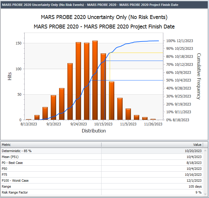
To give you a basic explanation, the Deltek Acumen Risk Exposure chart is a combination histogram and cumulative line graph – know to some as a Pareto chart. The typical formation for a risk analyzed project results in a so called “Bell Curve”. Each of the bars in the histogram shows how many times the project end date fell on or around the distribution date shown on the X axis. With each iteration of the Monte Carlo risk analysis process, a different project finish date is calculated based upon a range of randomly generated activity durations. In Deltek Acumen these duration ranges are controlled by the Duration Uncertainty and Risk Events register: one or both of which can be assigned to one, or a group of activities.
At the outer edges of the bell curve you see very few of the more extreme dates were calculated. As we get to the middle of the bell curve, greater numbers of projects are randomly falling on those dates. This builds a profile of when the project finished in each of many hundreds or even thousands of iterations.
The left ‘Y’ Axis gives a range of hits. The right ‘Y’ axis shows a percentage scale that is being used by the cumulative ‘S’ curve. The ‘S’ curve is simply adding the number of hits together as it moves along the ‘X’ axis of dates.
By tracking the X-Y intersection of the ‘S’ curve, we can see a ‘P’ value for that percentage. The ‘P’ value is basically the likelihood of completing a project by a particular date. For example P75 says you have a 75% chance of meeting the 10/16/2023 date in the above Pareto chart.
Watch the video to see a Deltek Acumen Risk Analysis process taking place and an explanation of the various results, ‘S’ curve, histogram and ‘P’ values.