Primavera P6 Professional is a great tool for monitoring project progress. It also supports reporting progress to stakeholders. Schedulers reporting progress can adjust the activity table graphics to give their schedule report a unique look and feel.
Most scheduler’s find the graphics of global standard predefined layouts sufficient for reporting. We, however, have a quick tip or two for schedulers that want more control over the activity table graphics. It is possible to adjust the font, color, and even icons displayed on each line of the activity table.
This article provides quick tips to support reporting work packages in the Primavera P6 Professional using activities table graphics.
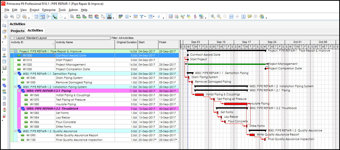
We have in Figure 1 our demonstration project.
 Figure 1
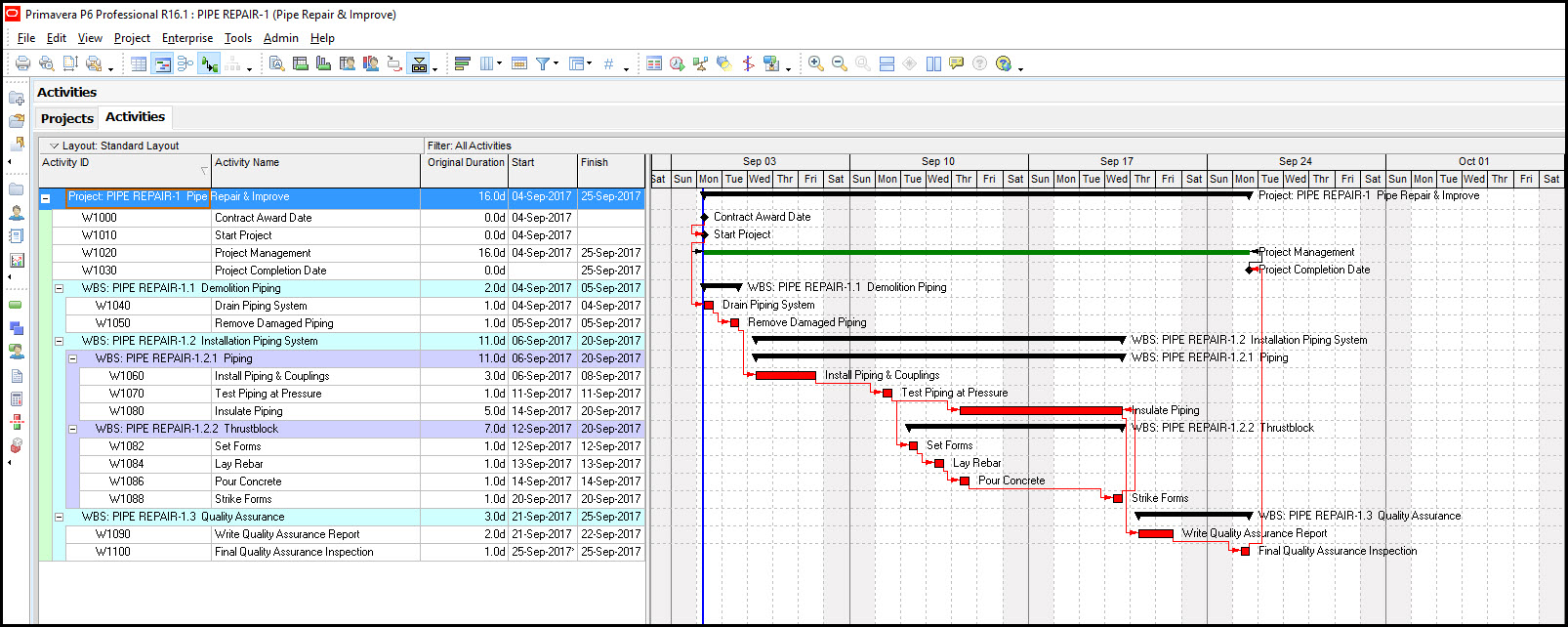
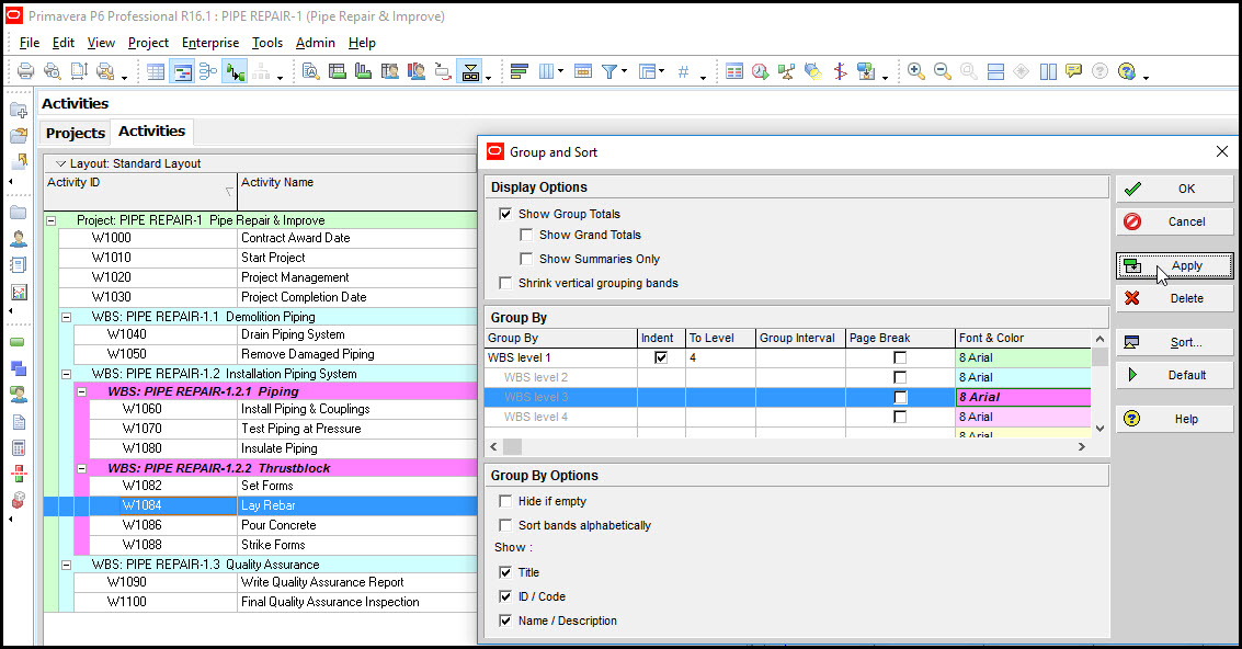
The activity table in Figure 1 lists the work packages, i.e. deliverables, which are color coded, and associated activities. We want our Piping and Thrust-block deliverables to stand out, so we want to adjust their color shading and text font.
Select the group and sort icon, Figure 2, to make changes to the work breakdown structure (WBS) elements (i.e. deliverables) color coding.
Figure 2
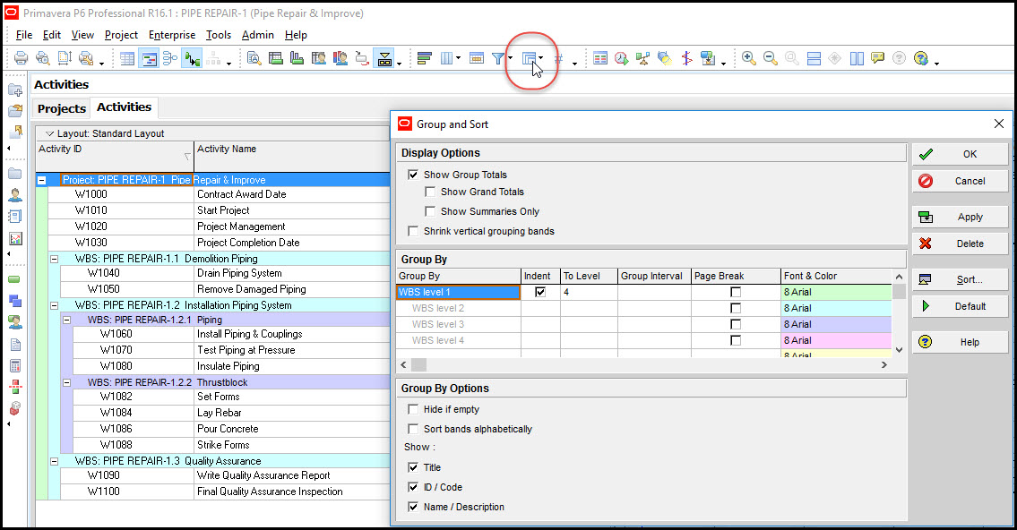
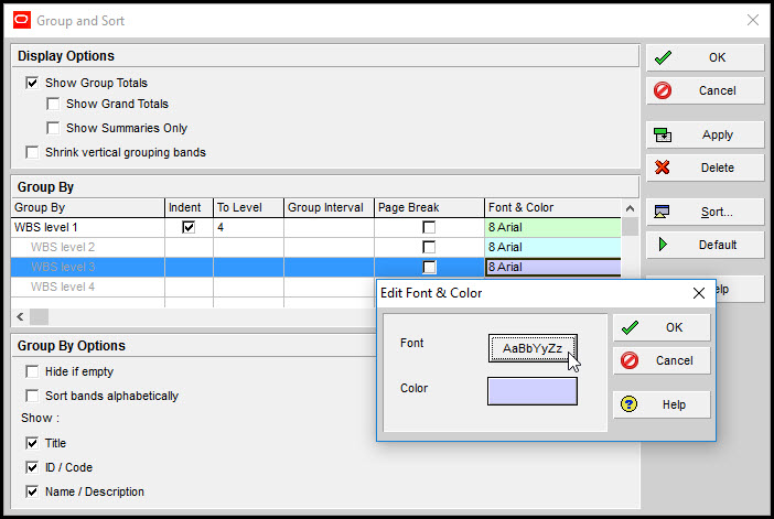
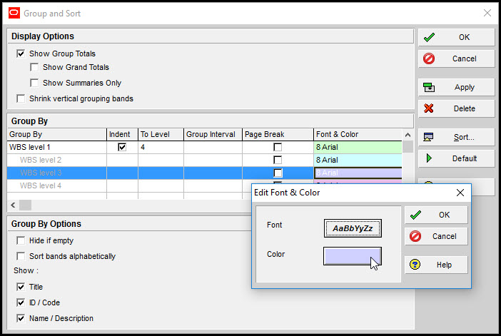
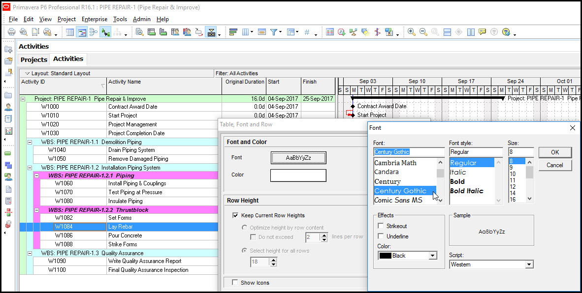
Note that group and sort is grouping by WBS levels. Highlight WBS Level 3 and double click on the WBS Level 3 Font & Color cell, then click the Font button, Figure 3.
Figure 3
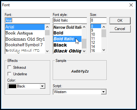
Change the font to ‘bold italic’, Figure 4.
Figure 4
Next select the color button, Figure 5.
Figure 5
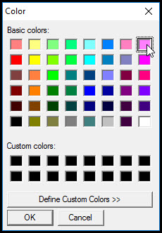
Select the desired color, e.g. magenta, Figure 6.
Figure 6
Select apply, Figure 7, and observe the changes to the Piping and Thrust-block deliverables labeling.
Figure 7
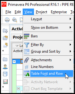
Now let’s change the labeling of the activities. Select View | Table Font and Row, Figure 8.
Figure 8
Click the font button and select an appropriate font, Figure 9.
Figure 9
This changes the font of all activities in the activities table, and all Gantt chart activity labeling, Figure 10.
Figure 10

Now return to View | Table Font and Row, and click the color button. Select the ‘define custom colors’ button, and define an appropriate color for the activity background, Figure 11.
Figure 11
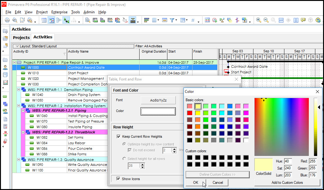
Figure 12 displays the schedule with light yellow activity shading.
Figure 12
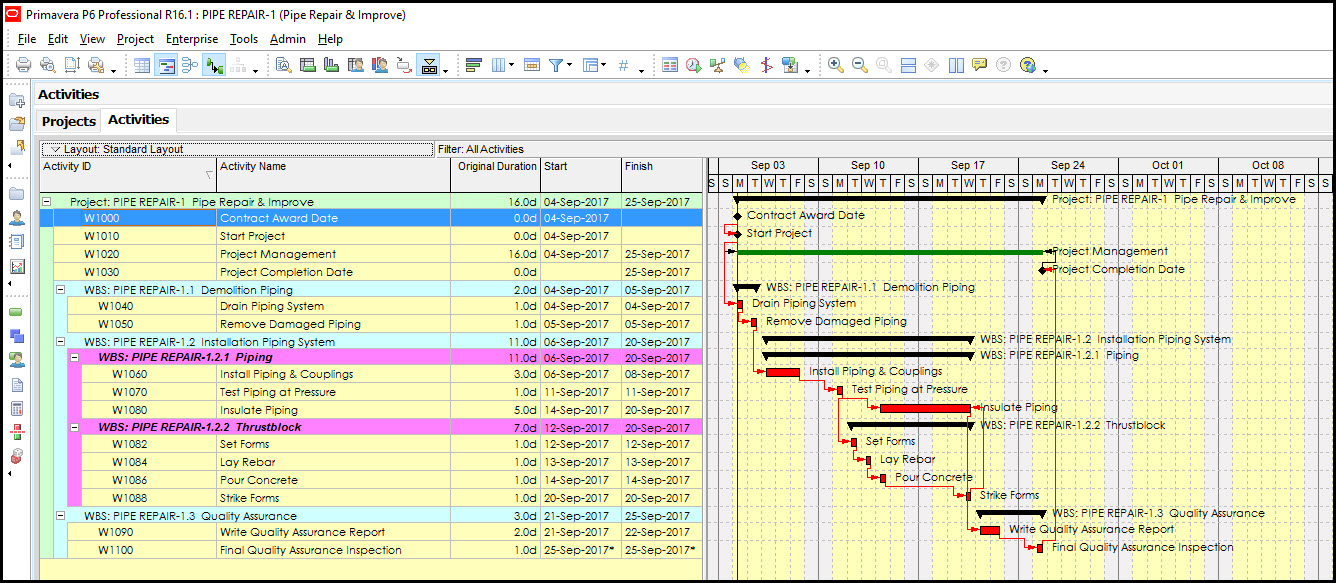
Note that this also changes the shading of week days on the Gantt chart.
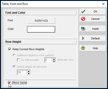
A former student thought it would be neat to know how to list project, WBS element, and activity icons. This is possible in View | Table Font and Row, Figure 13, by simply toggling on show icons.
Figure 13
Now P6 project, WBS element, and activity icons appear in the Activity ID column, Figure 14.
Figure 14
(Note we changed the Table Font and Row activity background color back to white.)
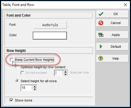
One final trick to control the look and feel of the activity table. Again, select View | Table Font and Row, Figure 15, and toggle off ‘keep current row heights’.
Figure 15
Change the ‘select height for all rows’, Figure 16, to 28 (up from 18).
Figure 16
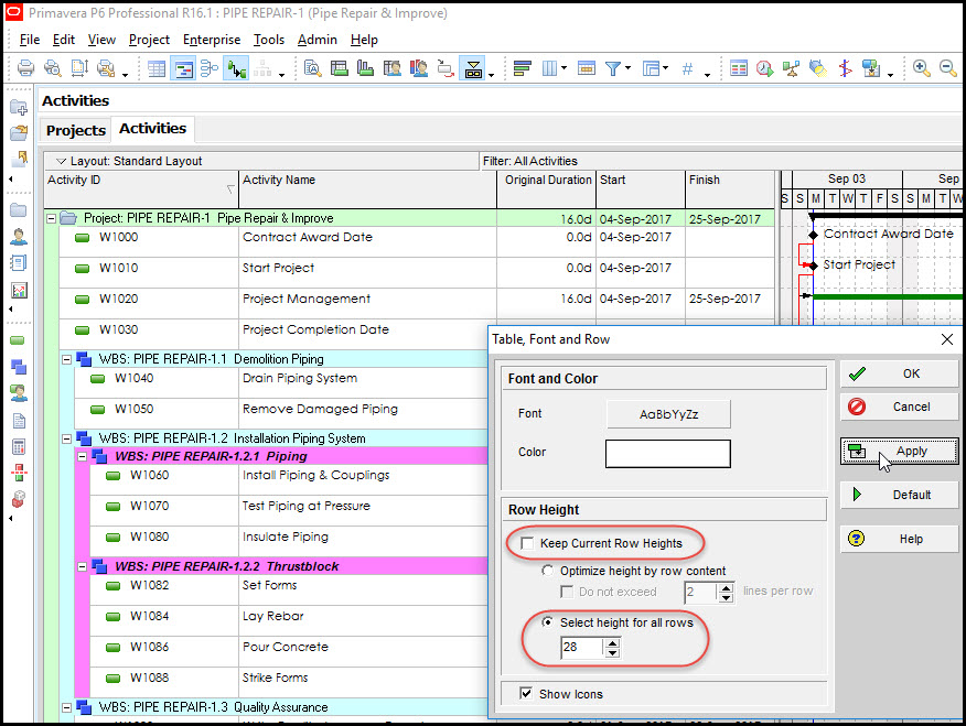
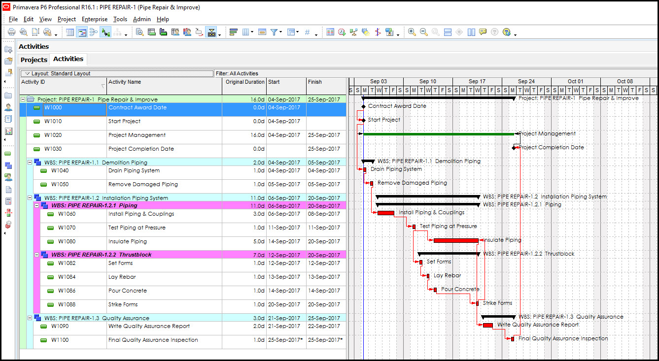
Click apply, Figure 16, and the final schedule appears as displayed in Figure 17.
Figure 17
Summary
Several features in Primavera P6 support personalizing the look and feel of schedule reports. In the group and sort feature schedulers can modify the font and color of WBS element labeling. The Table Font and Row feature supports modifying the font and color of activity labeling. Note that changing the background color of activity labeling also modifies the color of week day shading on the Gantt chart.
It is possible to display icons distinguishing among projects, WBS elements, and activities. Once your activity table graphics and Gantt chart appear as intended save the layout, and make it available to the current project. So with a few quick tricks it is possible to customize reports to make them distinctively unique.