Primavera P6 Professional has limited S-curve and histogram plotting features. If you are looking for an efficient way to plot S-curves and histograms of your P6 schedule, the you should consider using Adrega PI software. Let’s discuss.
Earned Value Management (EVM) unlocks the door to schedule analysis, otherwise not possible. Most schedules track the planned cost of work and actual cost of work. EVM additionally tracks earned value of work, hence the acronym EVM.
This earned value variable may be difficult to tabulate, but is the key that unlocks the door to an array of schedule analysis variables. EVM quantifies project progress and compares actual progress to planned progress and funds spent. It does this using only three metrics: planned value (value of work planned), earned value (value of work actually completed), and actual cost (funds spent).
To fully implement the benefits of EVM schedulers need more than just a snapshot in time. Schedulers want to plot the trend. Plots of the cumulative planned value, earned value, and actual cost over time provide this trending data. When plotted versus time, cumulative project schedule data tends to form a shallow ‘S’ shape, which is flatter at the start, steeper in the middle, and again, flatter at the end.
Regardless of how closely project data forms an ‘S’, S-curve is the terminology used when referring to cumulative time plots of project schedule data. Primavera P6 Professional has limited S-curve plotting features discussed in the our blog S-Curves in Primavera P6 Professional.
For more advanced S-curve and histogram plotting features you have to look to Adrega PI.
This article discusses the Primavera P6 Professional complementary software Adrega PI that provides more robust S-curve and histogram plotting features.
Adrega PI S-Curves
Sample graphs of EVM S-curves, although not plotted in P6 nor Adrega, are in Figures 1 through 3.
 Figure 1
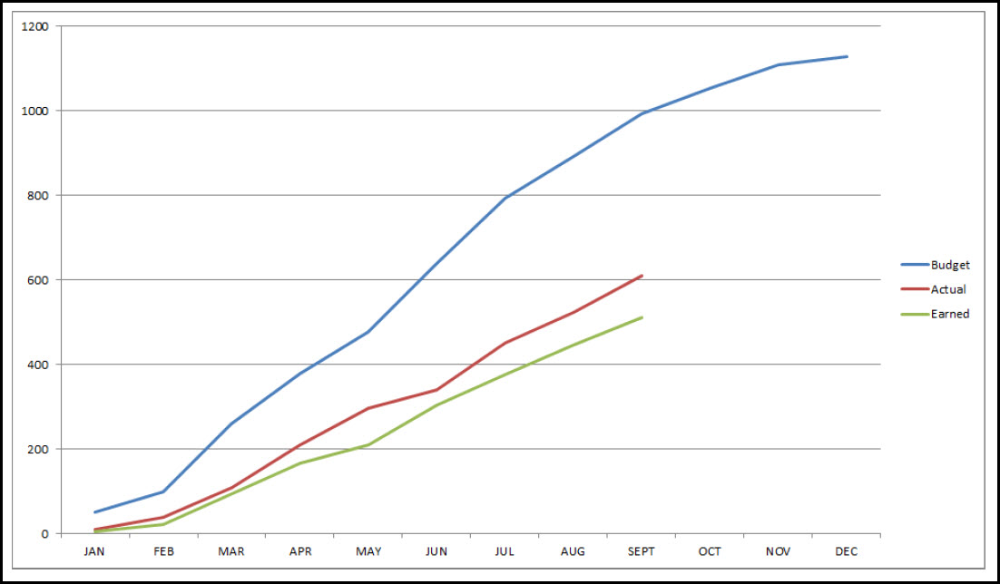
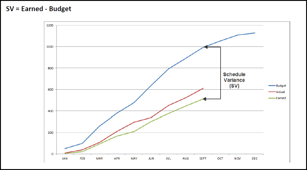
Figure 2
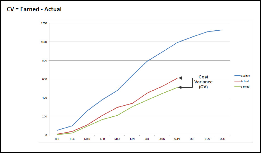
Figure 3
In Figure 1 we have cumulative schedule plots displaying the budgeted cost, actual cost, and earned cost. Figures 2 and 3 are examples of how the plots can provide schedule analysis variables.
In Figure 2 we locate the schedule variance (SV) and in Figure 3 we find the cost variance (CV). You will have to review the P6 S-curve blog yourself, but P6 has limited features for plotting schedule data. Instead Adrega software is recommended for plotting EVM S-curves.
In Figure 4 we have a sample of an Adrega generated S-curve graph.
Figure 4
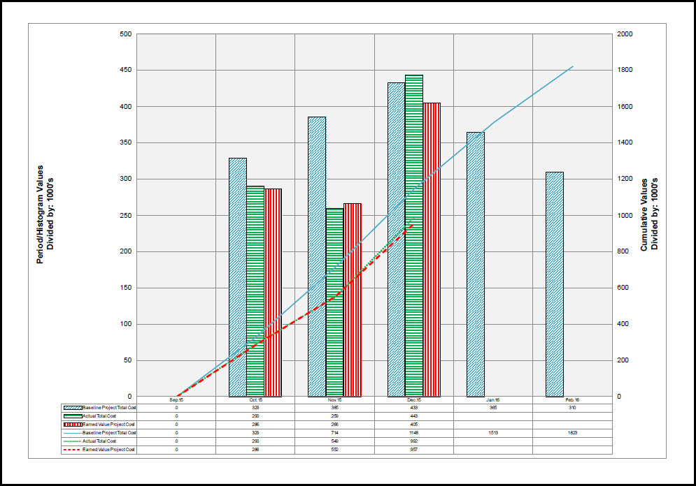
In Figure 4 we have cumulative S-curve plots of baseline project total cost, actual total cost, and earned total cost. This provides us with that valuable trend data, which schedulers and management can use to analyze the future direction of the project.
Additionally, overlaid on the S-curve plots we have period histogram plots that display the project total cost, actual total cost, and earned value cost for each month. Below we also have tabulated data of the cumulative S-curve plots and histograms. We therefore have in one graph the trend describing cumulative S-curves and the period highlighting histograms, i.e. trend performance and period performance in one graph.
What kind of analysis can stakeholders glean from this example combined S-curve and histogram? The early periods appear to project something less than happy news: the trend in the October and November months was to underspend and underperform the project. The schedule delays most likely are due to ramp up time. The project manager needs to focus on getting everyone on board and working.
The actual cost and earned value cost however; are almost equivalent for these two months, so that is good news. December also brought the good news that the falling behind trend was reversed. But as the histogram for December indicates this trend reversal came at the price of increased actual cost above earned value cost. Not good, however, this is one data point and not yet a trend. The project manager may have crashed critical activities in December resulting in the actual cost to earned value cost mismatch.
The project manager’s challenge in January is to continue to lessen the schedule variance, but without crashing or employing other techniques that would increase actual cost above earned value cost. As is evident from our analysis, the Adrega PI combined S-curve and histogram graph provides the project manager and stakeholders with a play-by-play early warning trend and period analysis of the project. And with this early warning data, analysis the project manager can make minor schedule adjustments before an issue becomes a major project performance problem.
Summary
Where Primavera P6 Professional is somewhat deficient, Adrega PI has nice robust schedule plotting features. Import schedule P6 XML data into Adrega to obtain enhanced schedule plots. First import the XML baseline and then each month’s XML data file separately. Once imported leverage Adrega’s graphing capabilities to plot cumulative S-curves and period histograms.
Adrega PI also provides tabulated data of plots. Yes, Adrega PI has the ability to print PDFs of graphs. In this way analysts can inspect a projects trend and period performance data and share with project stakeholders.