Monitoring near critical activities can be just as important as monitoring the critical ones. Once you have entered all your activities and activity relationships, and Primavera P6 has computed your critical path, you’ll know all the activities that have zero float. These are the activities that could cause a delay to your project if not performed exactly according to the schedule. But what about the activities that are near critical? That is, what about activities that could easily become critical, even with minor delays? These are your near critical activities, and you, as the scheduler, need to be aware of where these activities are located on your Gantt chart. You need to keep an eye on them in addition to your critical activities.
This article describes how to create a filter and corresponding bar chart, so you can easily view near critical activities on your Gantt chart.
Step One: Create a Filter
Primavera P6 allows for the creation of both simple and complex filters. Fortunately, the filter required for monitoring near critical activities is fairly straight forward. To create a near critical filter first select the filter icon in the layout tool group at the top of the screen or select View | Filter By from the main drop down menu, again, at the top of the screen. From the resulting Filters dialog window select the + New icon.
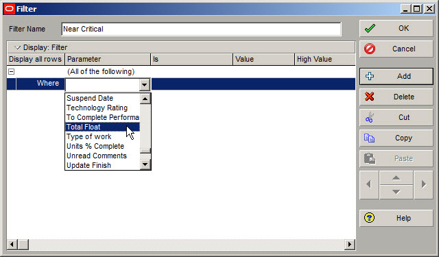
This will bring up the Filter dialog window. In the Filter Name block type enter an easily identifiable name for your filter, such as Near Critical. In the Parameter field displayed in Figure 1 select “All of the following”, although “Any of the following” should work equally as well for this filter.

Figure 1

For the parameter cell next to Where select the Total Float parameter, Figure 2. The cell underneath the Is header should be set to “is within the range of”.
Figure 2
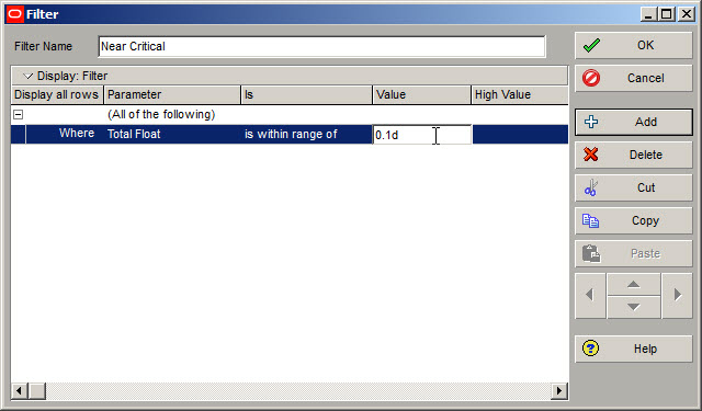
In the cell underneath the Value header type enter the low Value of “0.1d”, Figure 3. In Figure 3, d stands for day. Make certain you type in a lower case d here or you will get a non-valid value message. For the High Value cell type in “10d”. If you wanted to limit your near critical filter further, you could type in “5d” here or any number between 10 and 0.1.
Figure 3
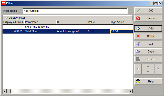
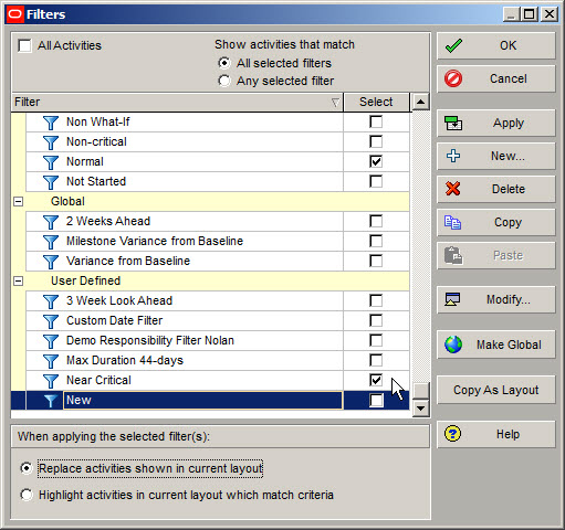
Now your Near Critical filter should look like that displayed in Figure 4. Select OK to exit the filter creating dialog. At this point do not select your Near Critical filter, as your Gantt chart would then only display Near Critical activities.
Figure 4
Step Two: Create a Bar
The second step of the process to monitor near critical activities is to create a Bar to highlight near critical activities. To do this select the Bars icon from the layout tool group or select View | Bars from the main drop down menu. Select the + Add icon. In the name cell type in an identifiable name, such as Near Critical. For the cell underneath the Timescale header select Remain Bar from the menu selection, Figure 5.
Figure 5
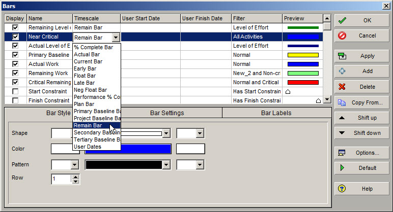
Click on the cell underneath the Filter header, which will bring up the Filters dialog window. Select the default filter Normal along with your newly created Near Critical filter, Figure 6.
Figure 6
The Normal filter is a default filter displayed in Figure 7. We select this along with your newly created filter to ensure that only normal activities, non-milestone and non-Level of Effort activities, are inspected for near critical activities.
Figure 7

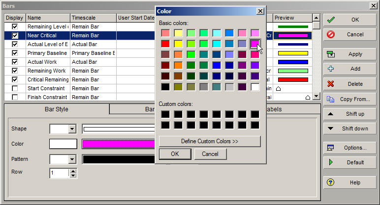
In the Bar Style tab at the bottom of the Bars dialog window select an easily identifiable color, such as magenta, to distinguish near critical activities, Figure 8.
Figure 8
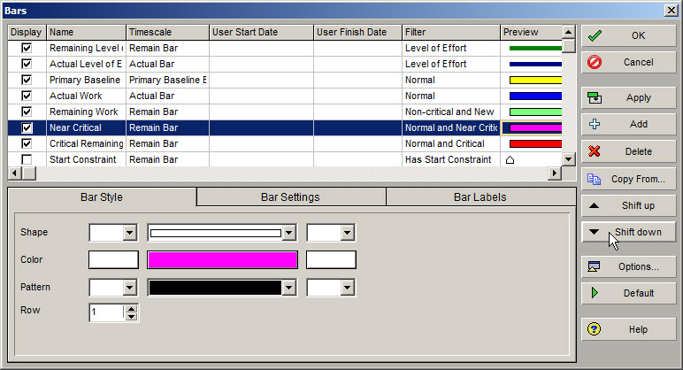
The last step before you click Apply to display the Near Critical activities is to select the down arrow icon, Figure 9. This will make certain that the Near Critical Bar you just created comes lower or after the Non-Critical and New Bar, which is the color green in this sample problem.
Figure 9
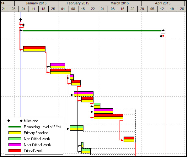
Now select Apply and you will see a Gantt chart displaying Non-critical and New Bars (green), Critical Bars (red), and Near Critical Bars (magenta) above the yellow baseline bars similar to the example in Figure 10. Of course, you will only see magenta bars if your project only has activities with less than 10-days of float.
Figure 10
Movie Time
For those of you interested in seeing this all live using Primavera P6, then check out our video showing this blog in action.
Summary
The activities view has the option to display the total float of each project activity. However, it may be easier to spot specific activities, such as Near Critical activities, on the Gantt chart. Primavera P6 allows you to display near critical activities on the Gantt chart:
- By creating a simple filter
- By creating a Bar type that uses that filter to highlight only the Near Critical activities
This is one of many ways to use Primavera P6’s abundant functionality to organize and highlight activities for analysis.